



Tokens from Figma
I generate code tokens from Figma variables. I define semantic roles such as Primary and Danger so each theme can supply the right values to components.
The design system for Claro Chile and VTR.
Claro Chile's design and engineering teams
Design System · Claro and VTR · Light and dark
Design tokens / React components / Storybook
The idea
At Claro Chile, I lead the design system's development from the ground up. My work covers token architecture, React components, and Storybook documentation. The system supports Claro and VTR in both light and dark modes, with naming and conventions shared across Figma and code.
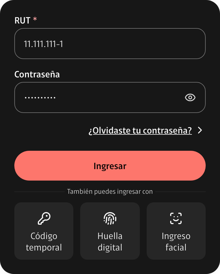
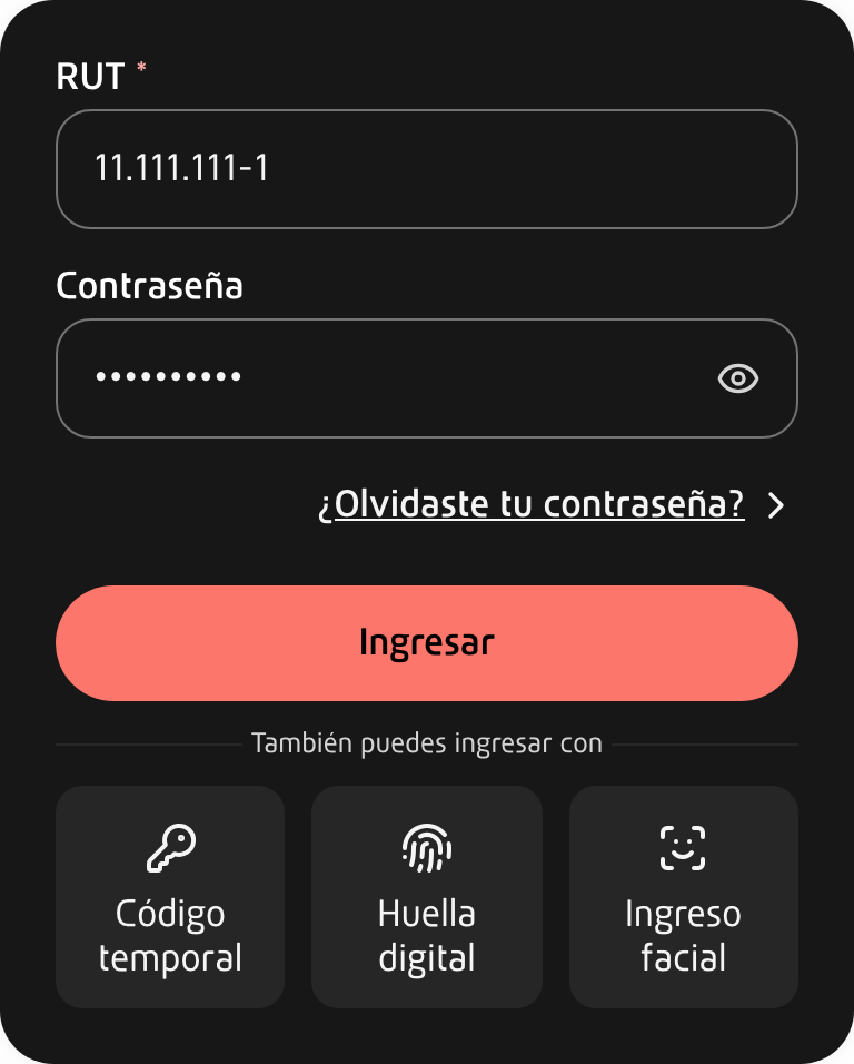
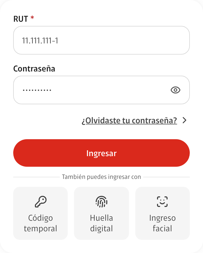
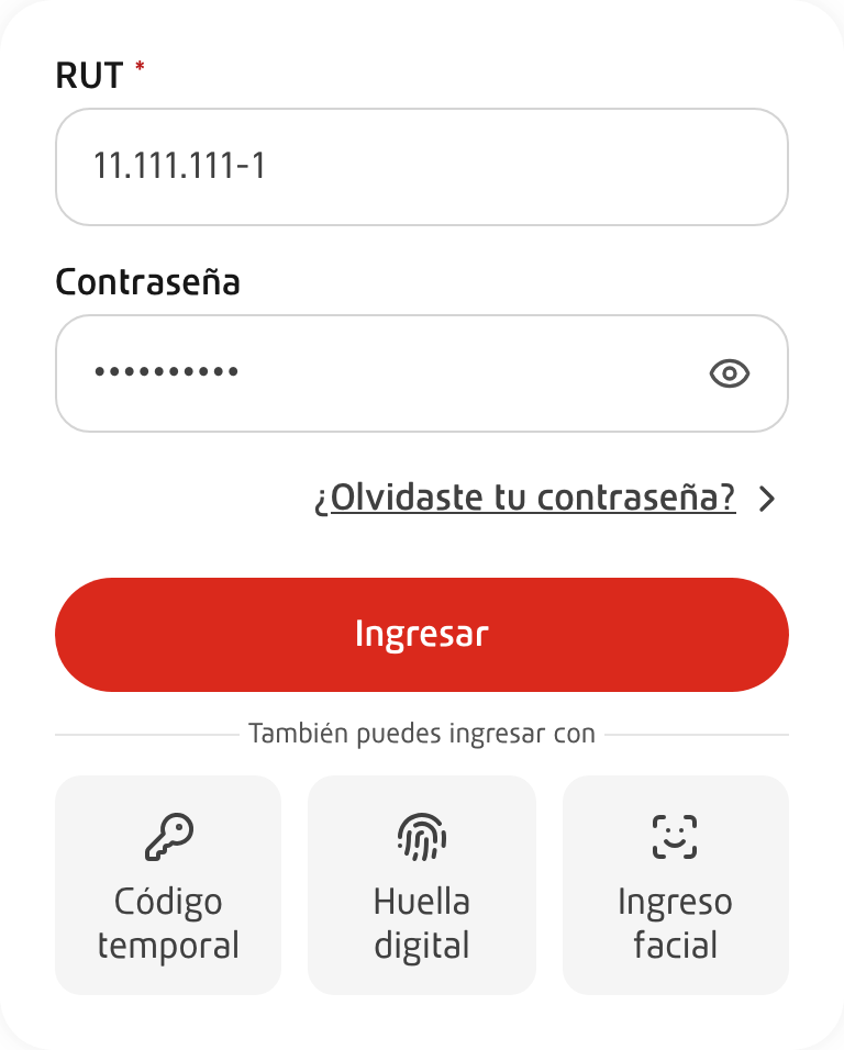
Screenshots come from the system's Storybook. In dark mode, alternative sign-in options sit on a slightly elevated surface to maintain contrast.
Foundations
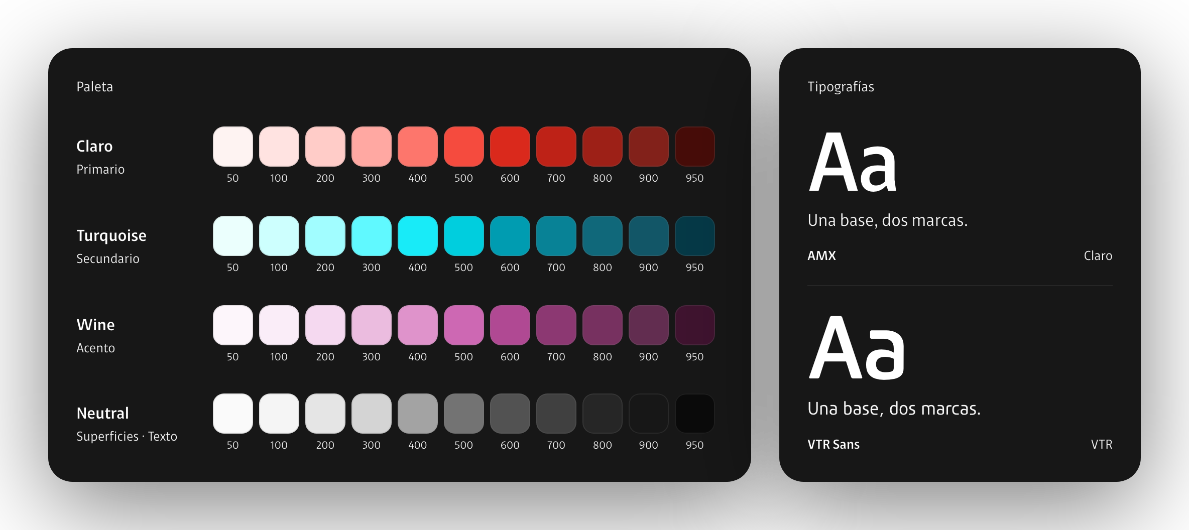
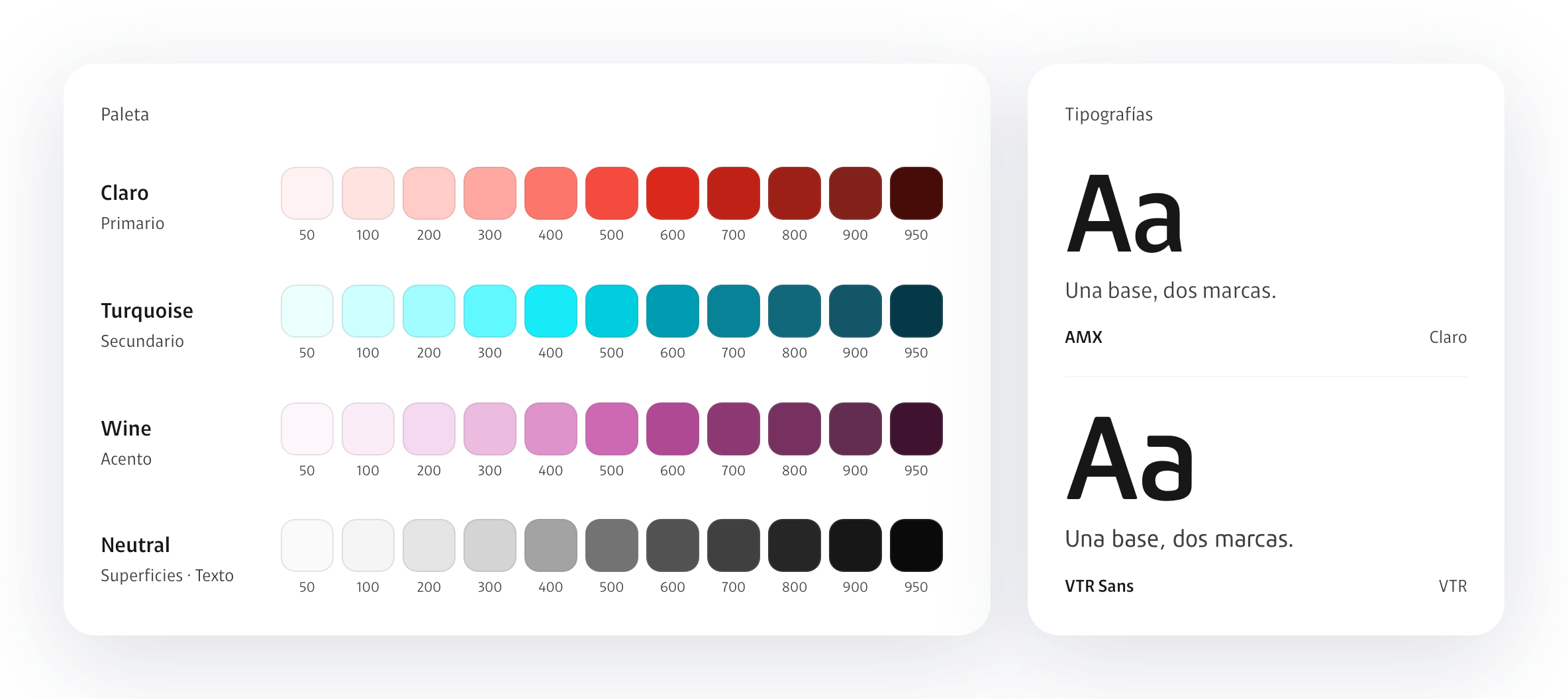
I define matching color ramps for Claro and VTR, using AMX and VTR Sans as their respective typefaces. Component structure stays consistent.
Components
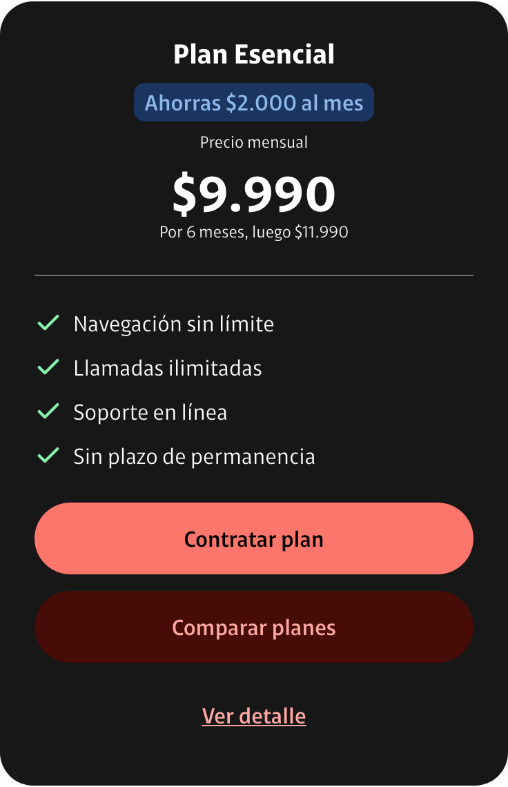
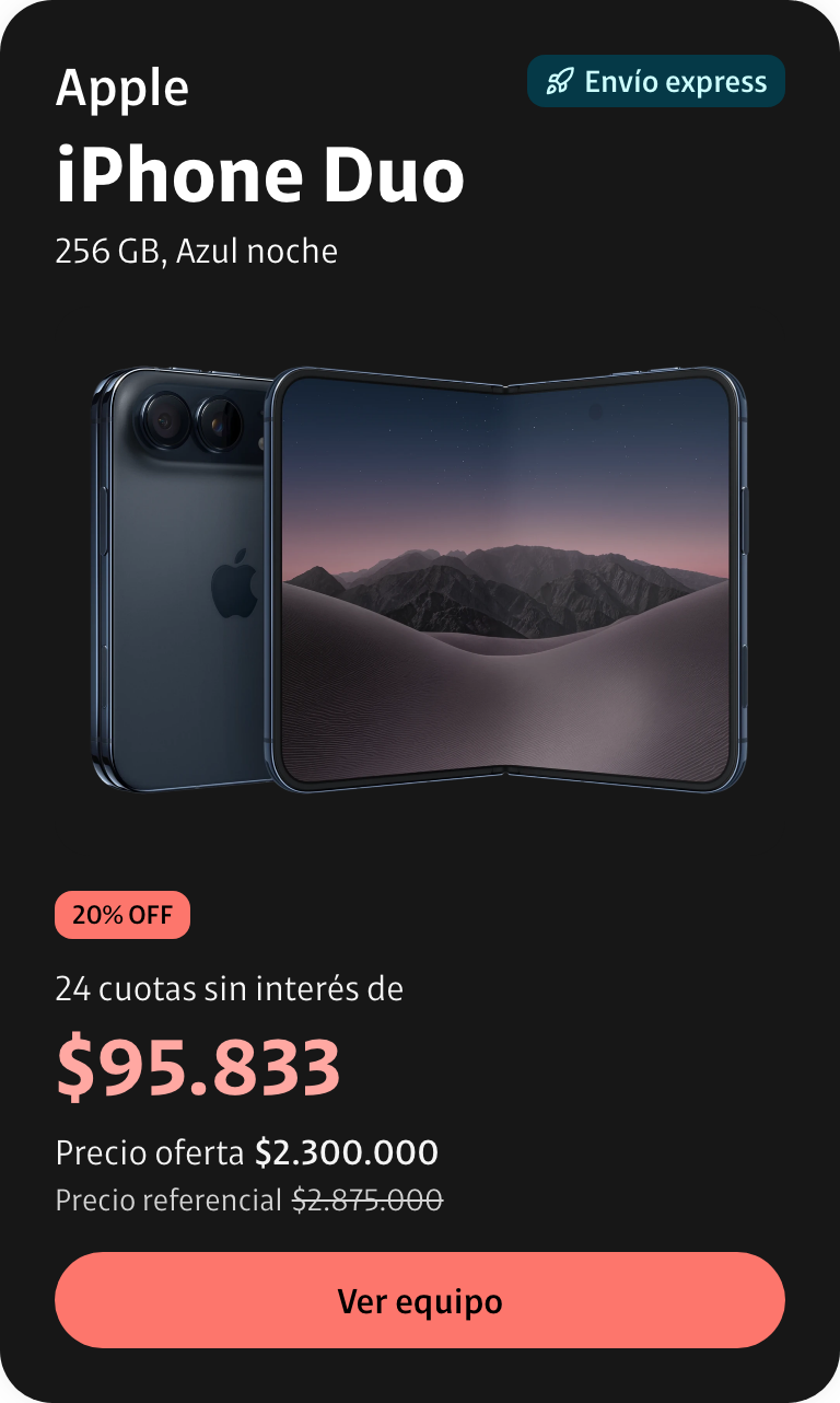
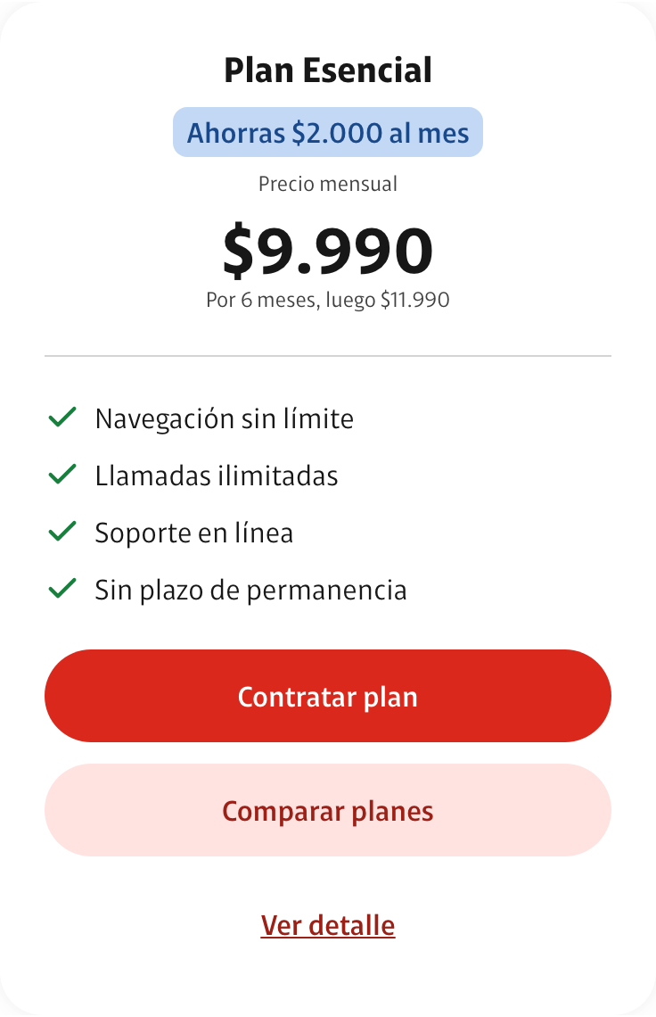
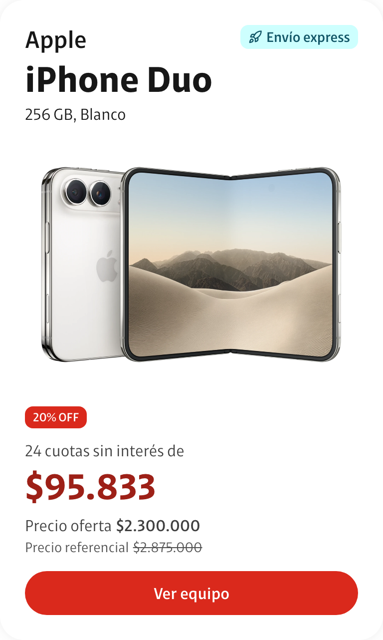
I build plan and device cards with pricing, terms, and actions. They share tokens so they can adapt to the active brand and theme.
Forms
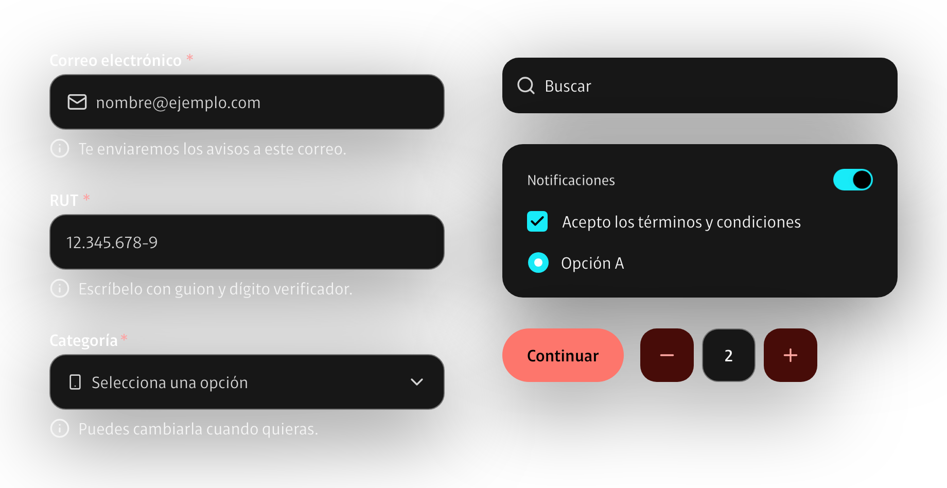
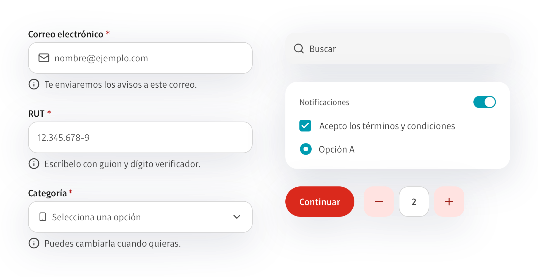
Fields include labels, help text, errors, and clear states. I test keyboard behavior alongside other controls.
Tokens
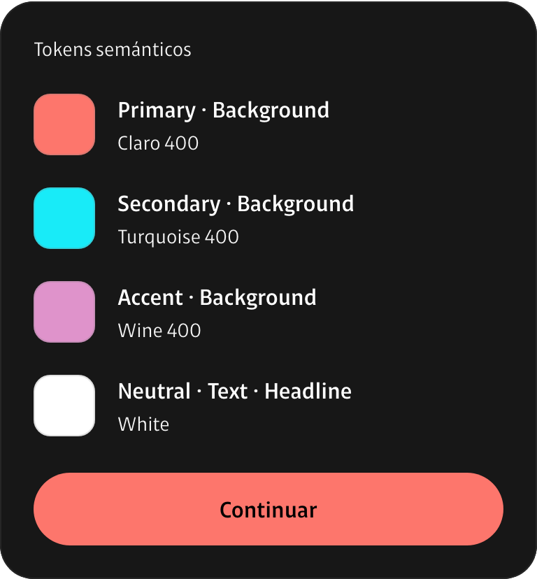
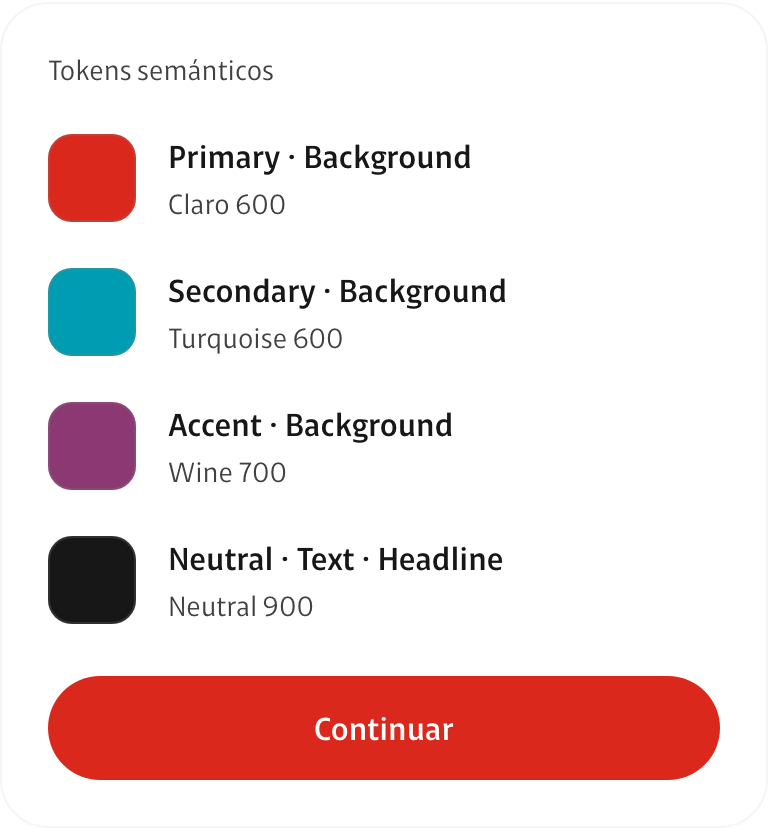
I assign roles such as Primary and Accent to components. Each theme defines the values and adjusts dark-mode tones to maintain contrast.
Implementation
I generate code tokens from Figma variables. I define semantic roles such as Primary and Danger so each theme can supply the right values to components.
I document every component in Storybook with interactive examples, usage guidance, and accessibility checks.
The design system for Claro Chile and VTR.
Corporate work: I share only the fundamentals, using sample data.