



Named variables
I defined the Figma variables used by components: Theme/Primary for branding, Spacing/2, /4, and /8 for a 4 px-based spacing scale, and DM Sans for Headline, Title, Text, and Caption roles.
The design system I worked on for Cencosud.

Cencosud's design and engineering teams
Design System · Figma · Desktop and mobile
Figma Variables / Component Sets / Atomic Design
The idea
During my time at EPAM NEORIS, I created and maintained a Figma design system for Cencosud. I organized components into six Atomic Design families and defined variables for color, spacing, radius, and typography across desktop and mobile interfaces.
These assets were exported from the Figma file and retain the sample copy used in its documentation.
Color
I separated variables into Theme for branding, Feedback for states, and Neutral for surfaces and text, with Softest and Stronger pairs.
Typography
I organized DM Sans into Headline, Title, Text, and Caption, with three weights and up to four sizes. All components use the same Text building block.
Spacing
I defined spacing, radius, and elevation variables. Spacing/2, /4, and /8 map to 8, 16, and 32 px; buttons and cards share an 8 px radius.
Variants
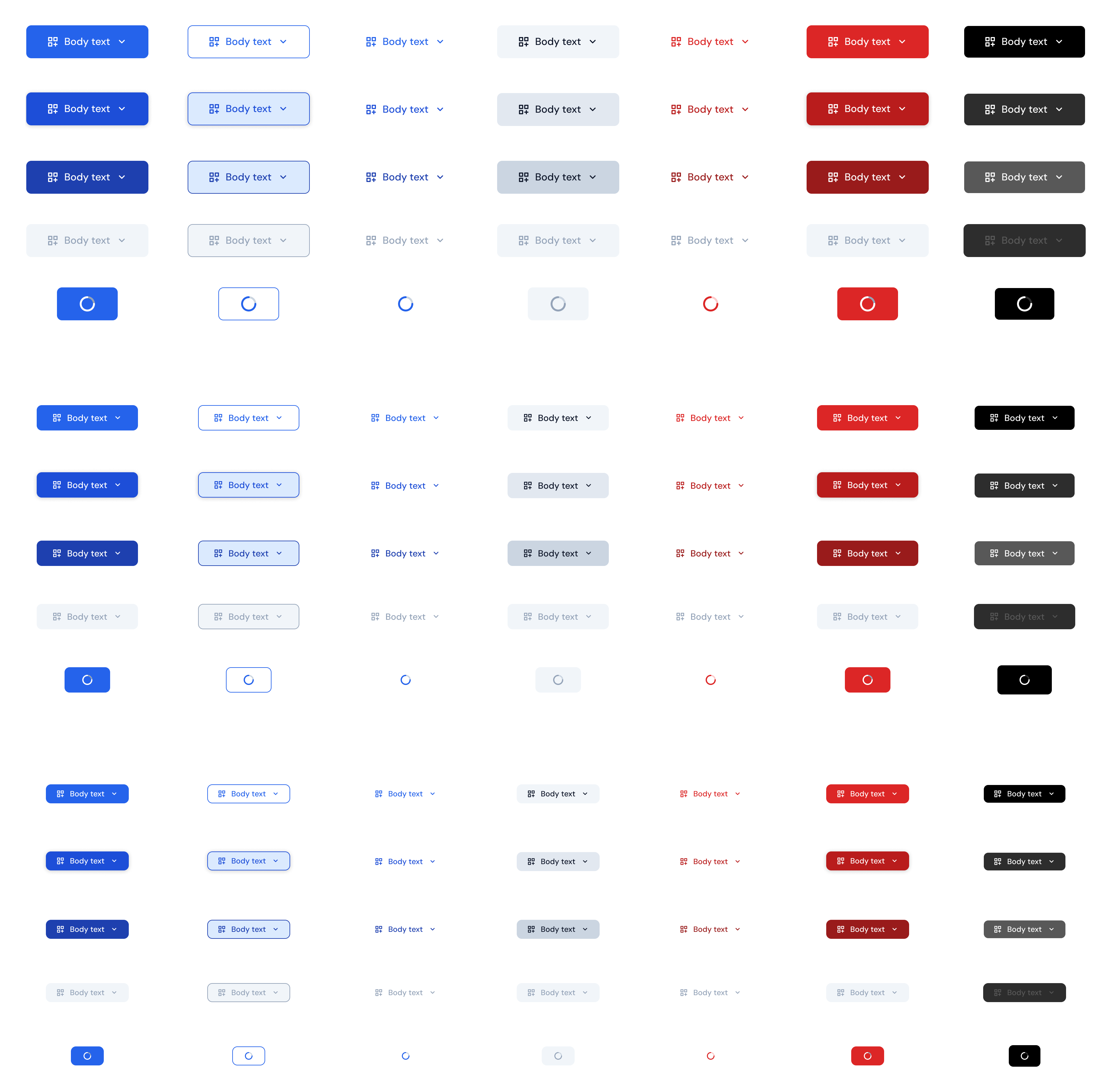
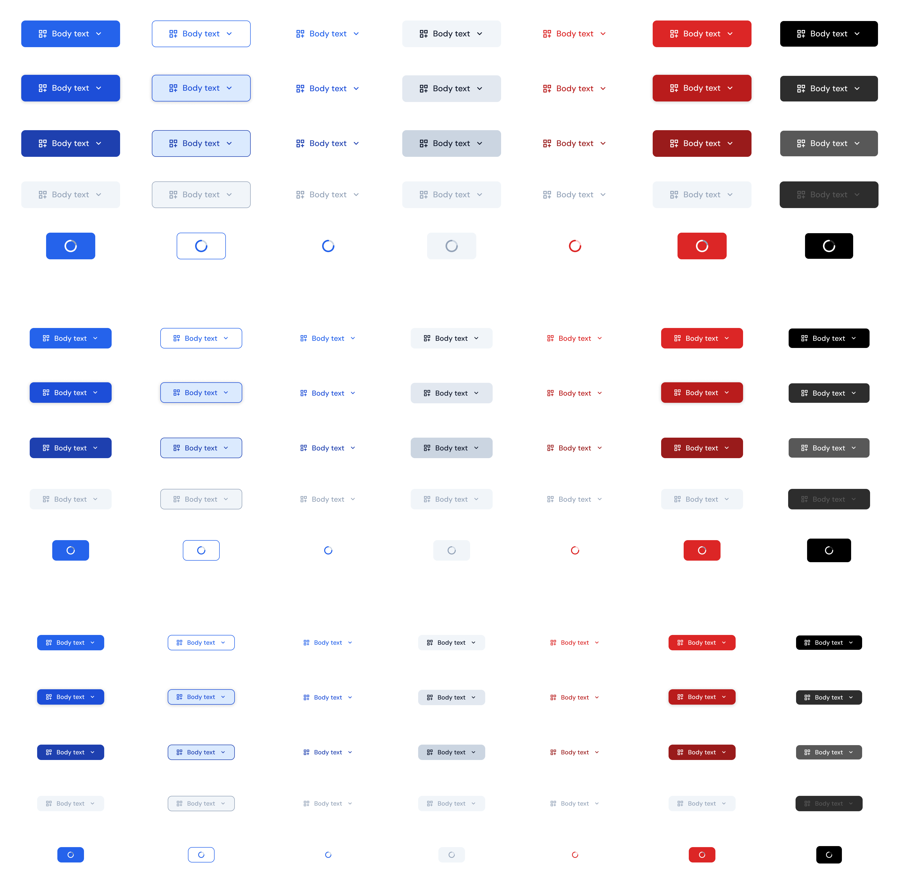
I created seven styles from Primary to Overlay, with hover, pressed, disabled, and loading states across three sizes.
Forms
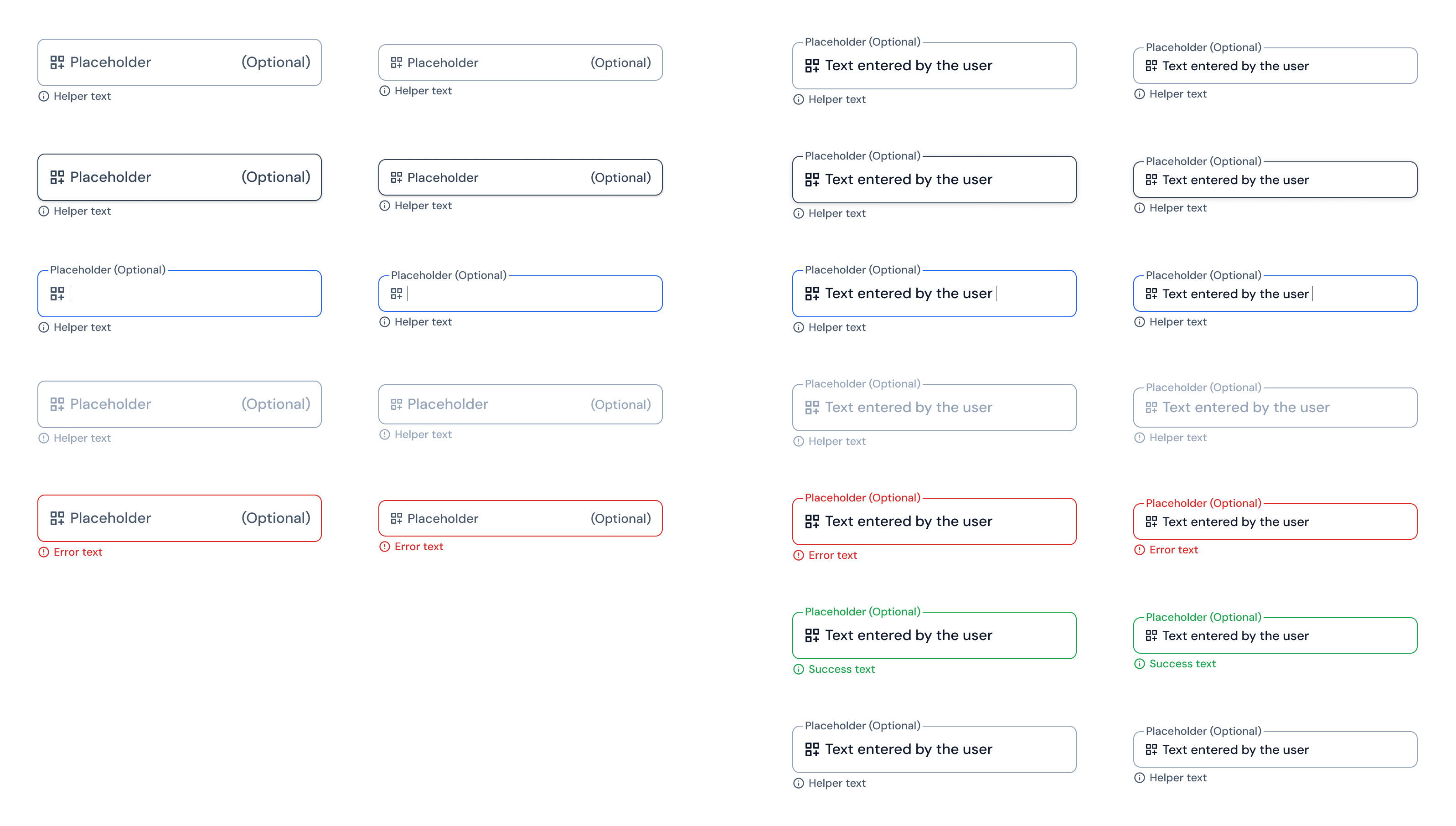
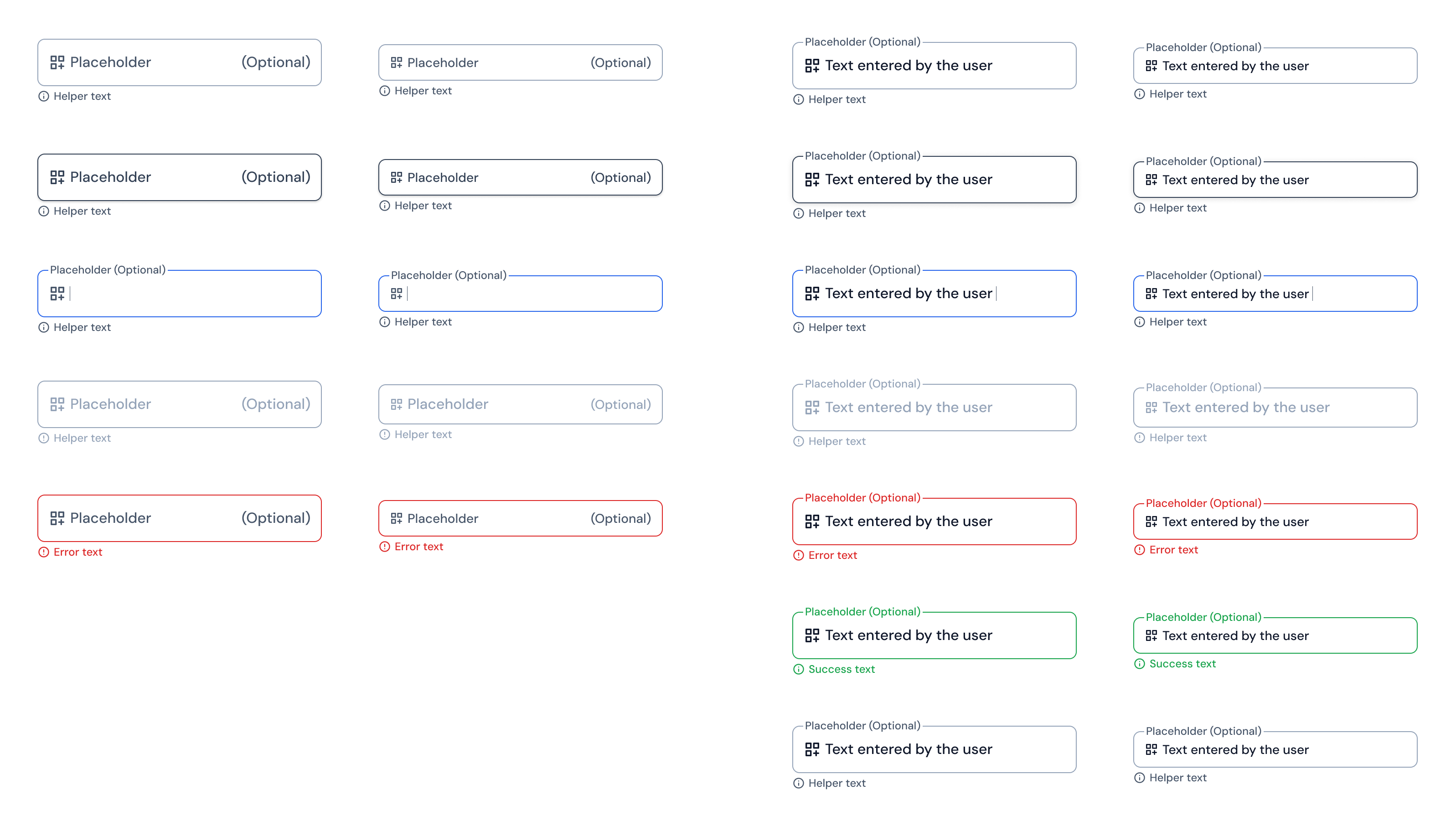
I included labels, help, and validation, with empty and filled variants in two sizes and states up to read-only.
Controls
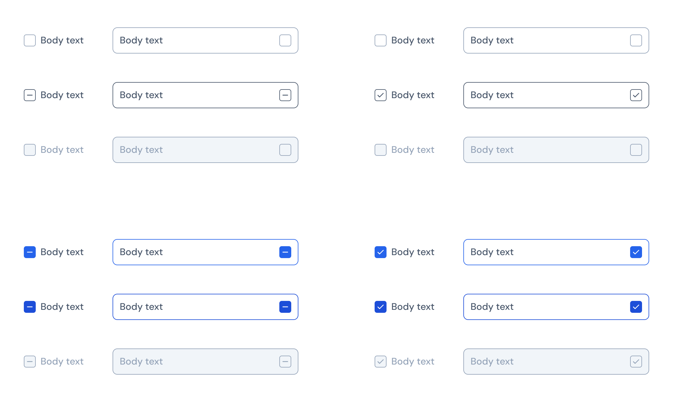
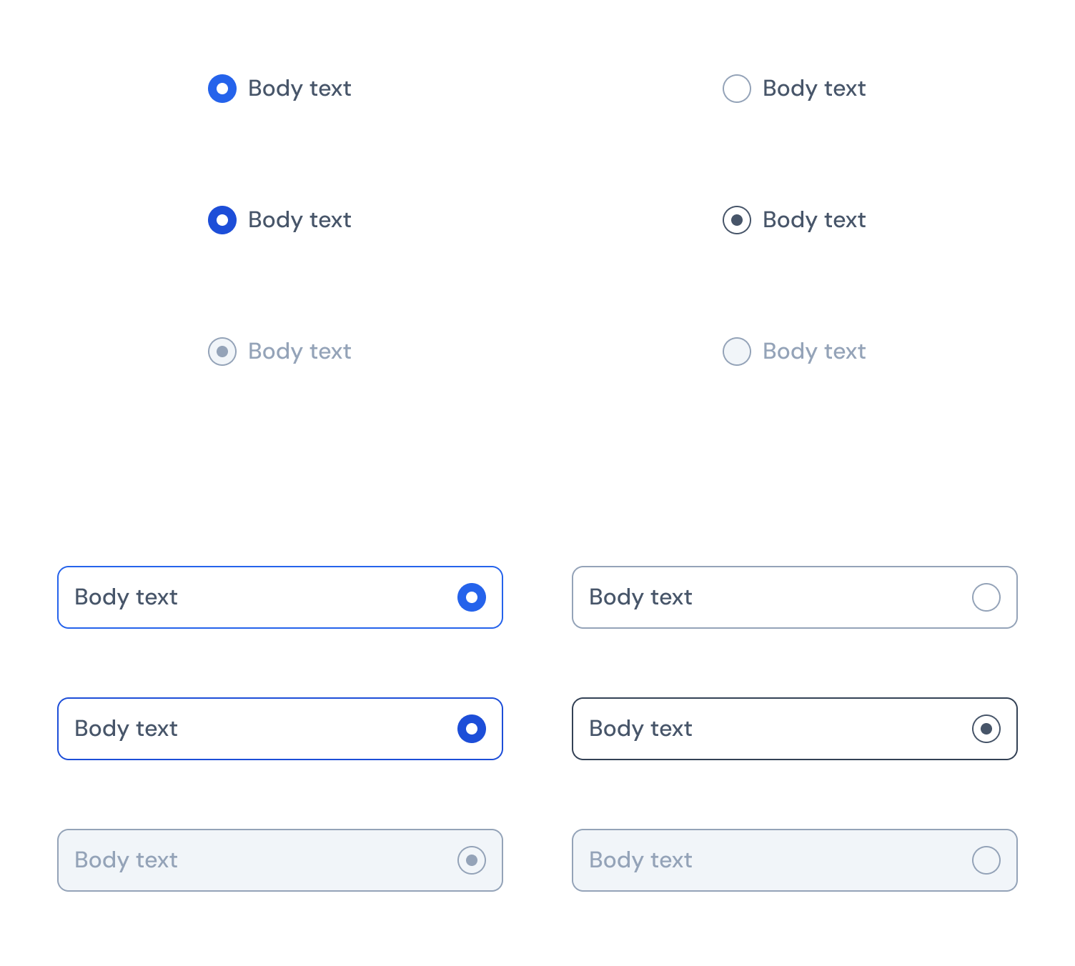
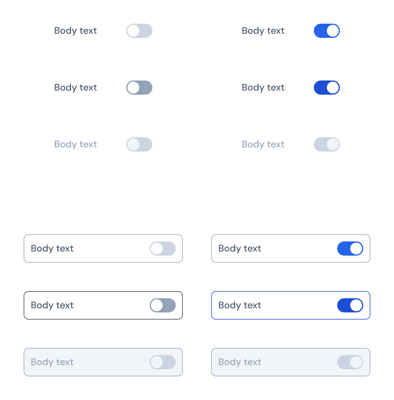
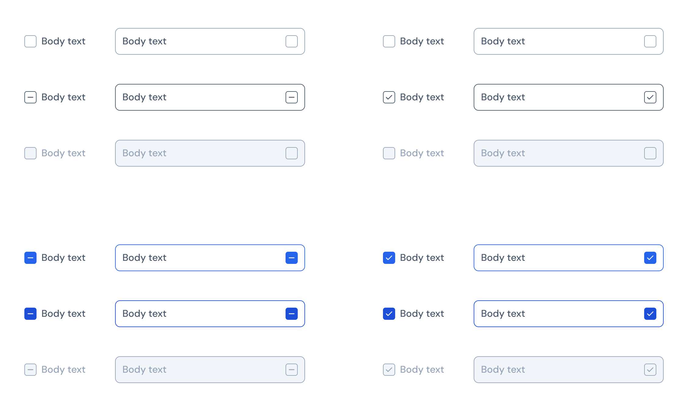
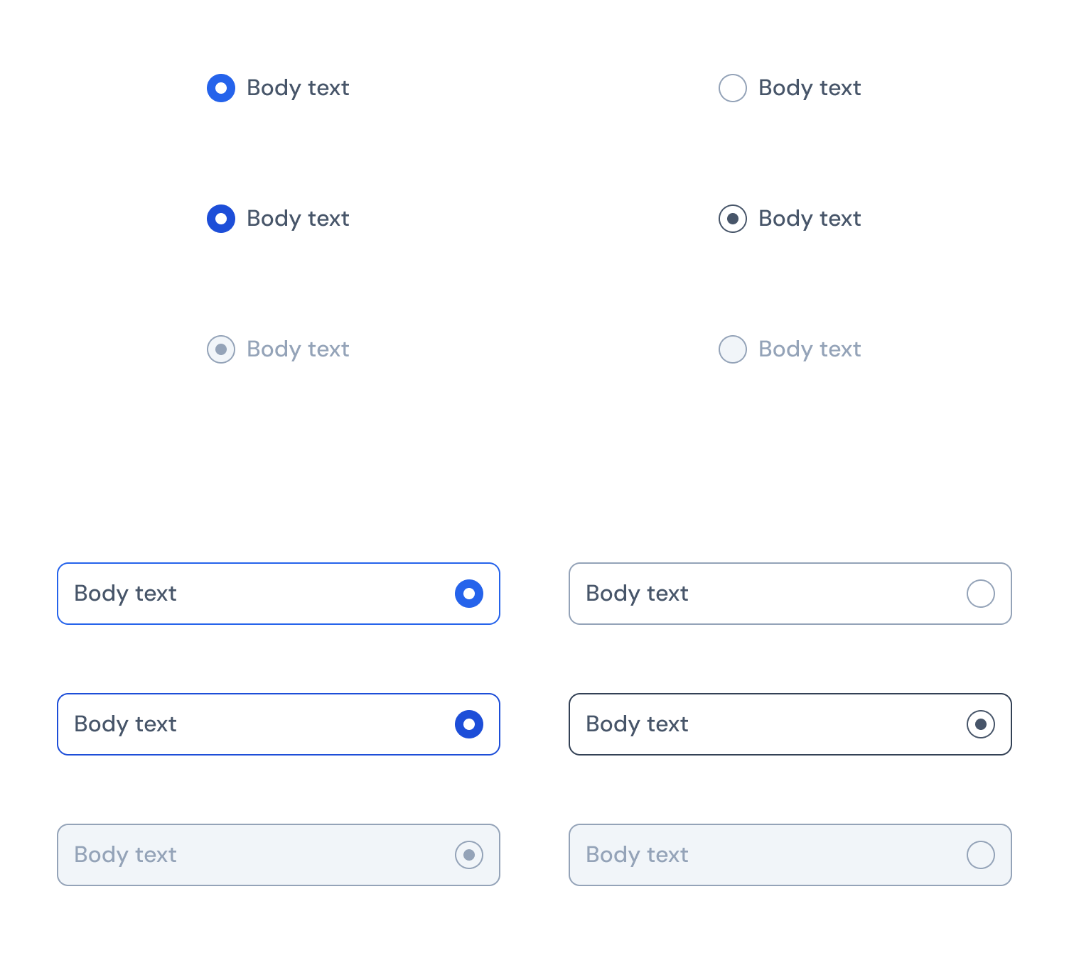
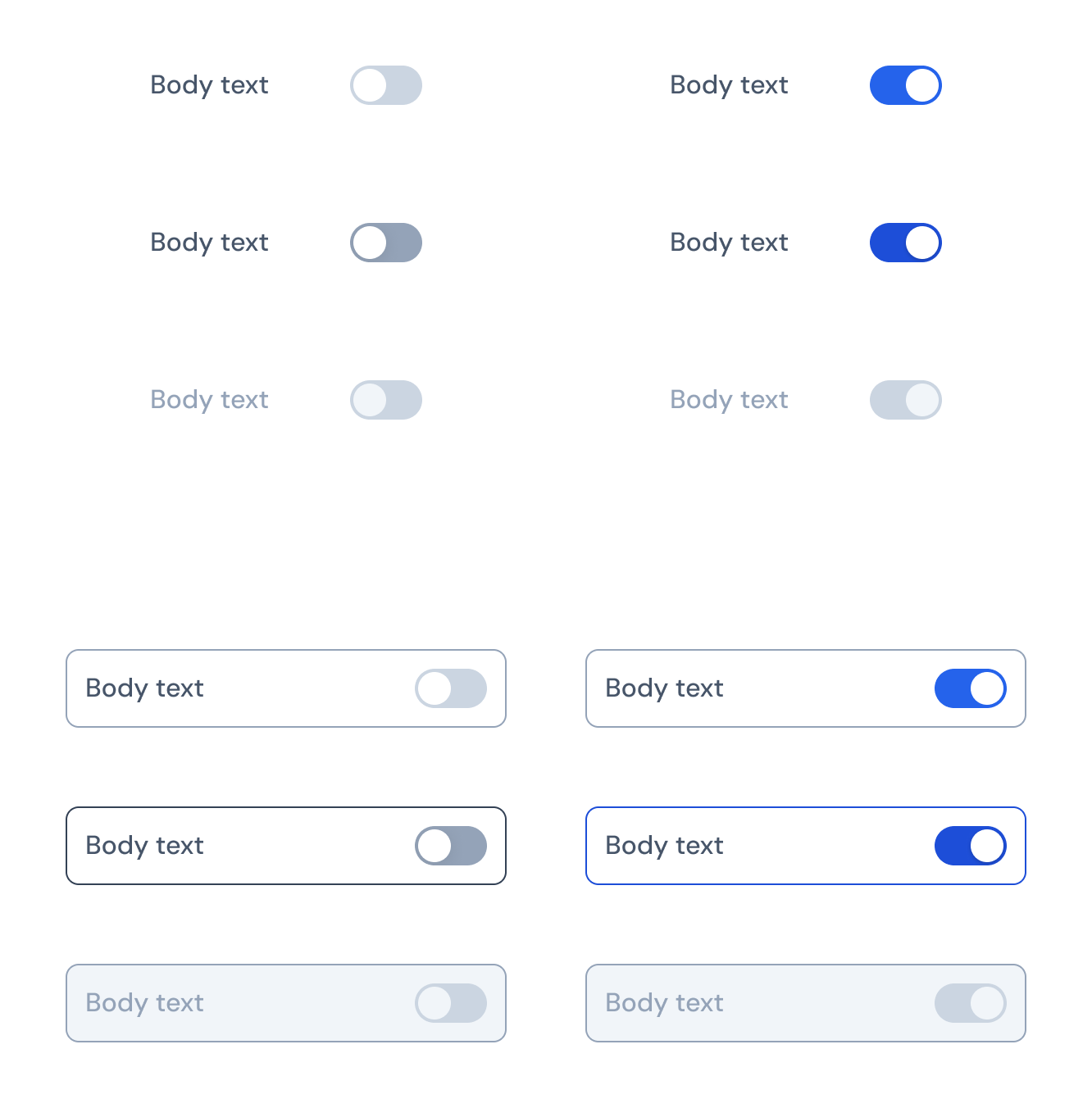
I designed Checkbox, Radio Button, and Switch as standalone controls and within fields, including active and disabled states.
Feedback
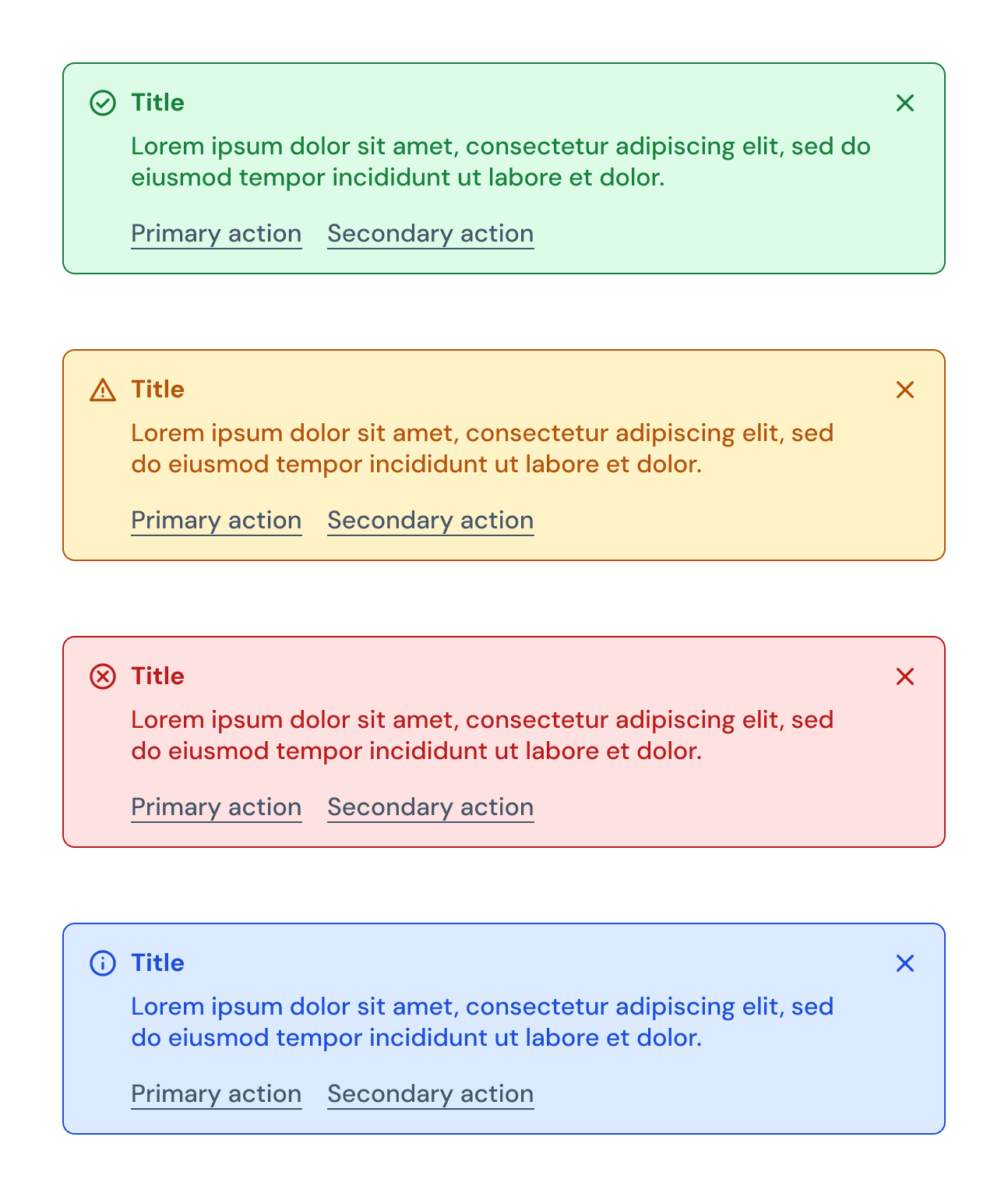
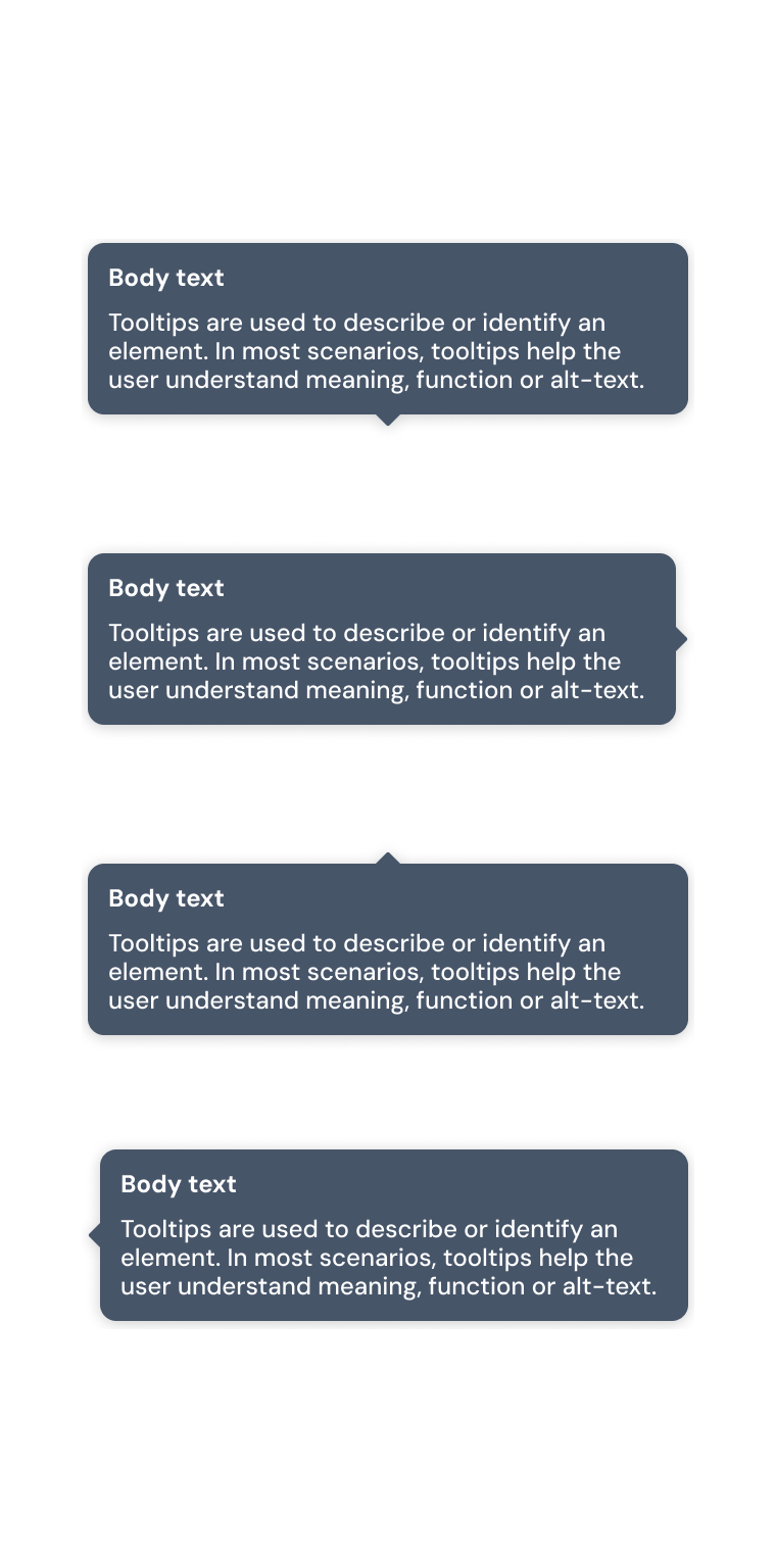
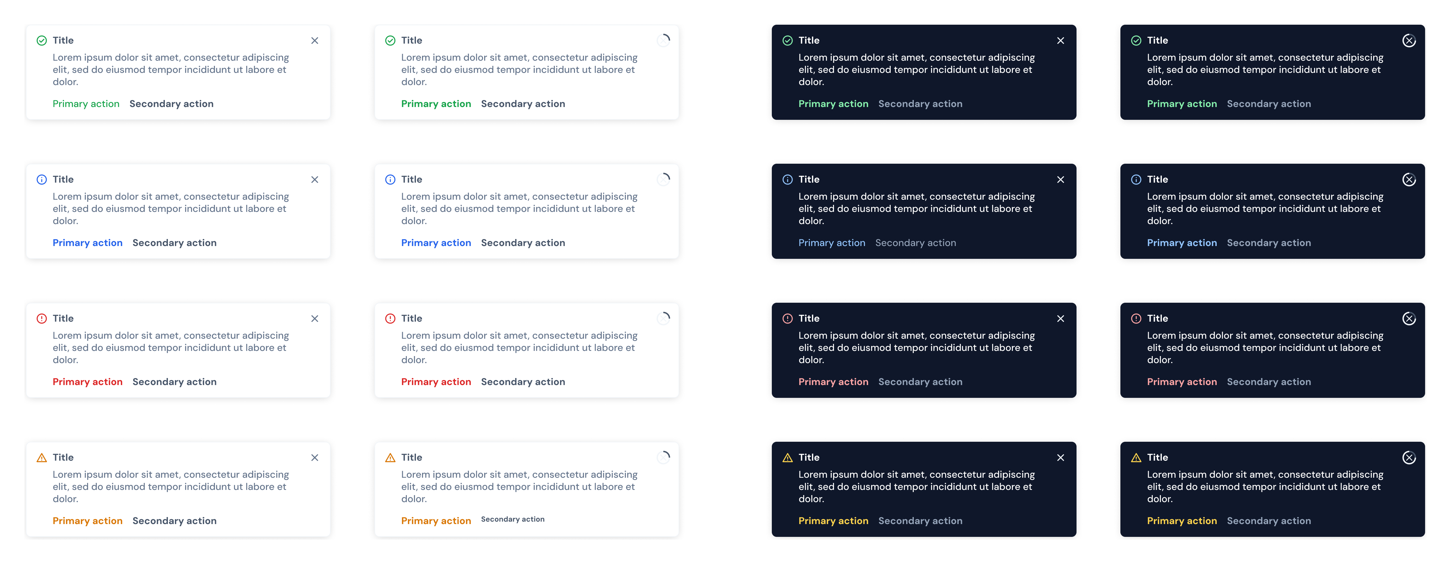
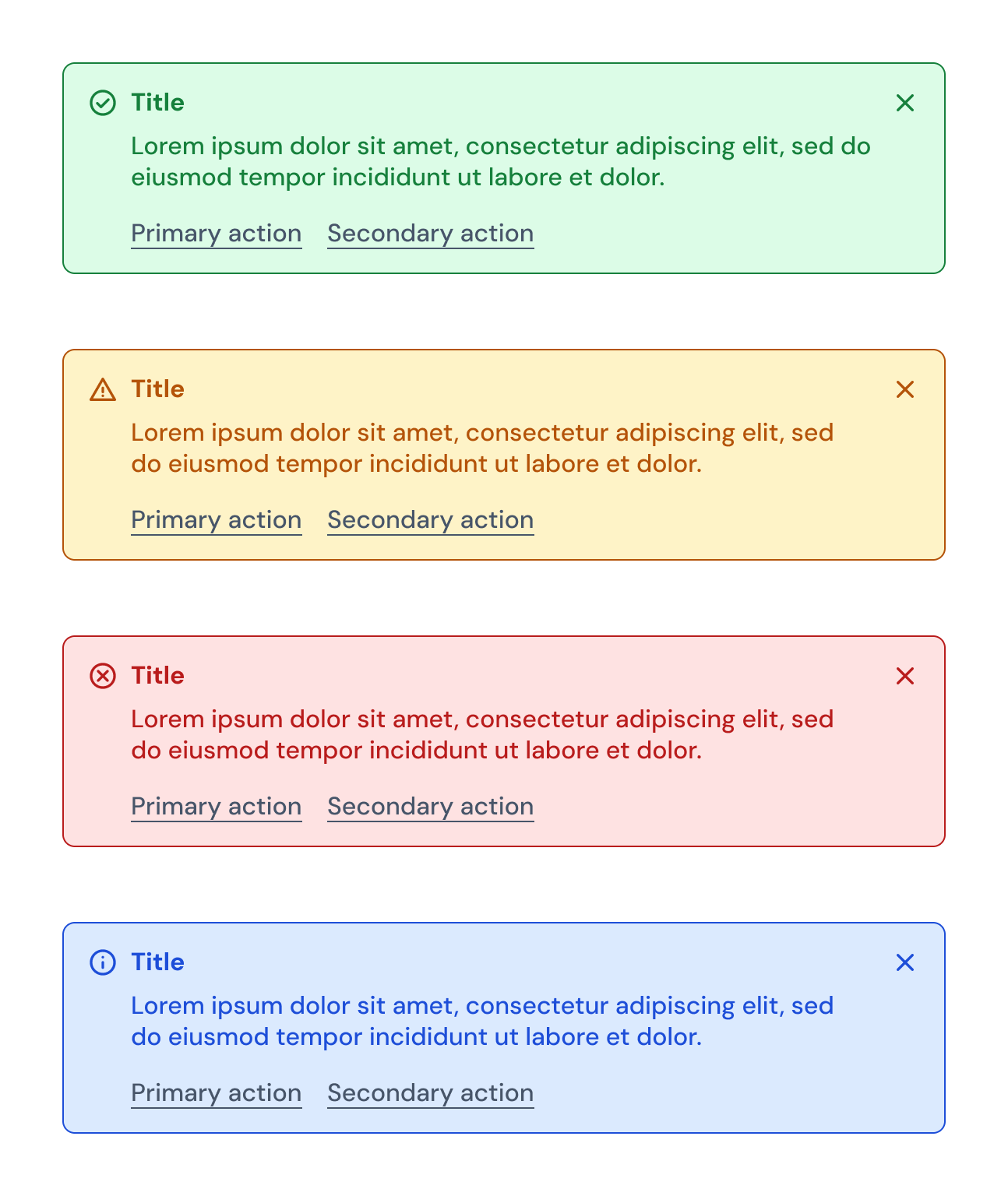
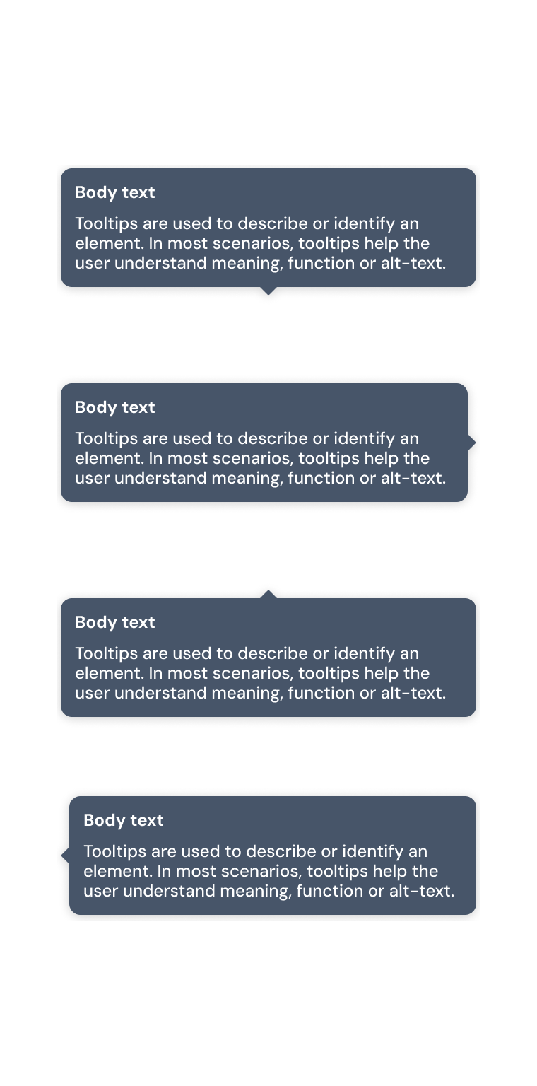
I defined a shared icon, title, and message structure for alerts and tooltips, with actions where appropriate.
Appearance
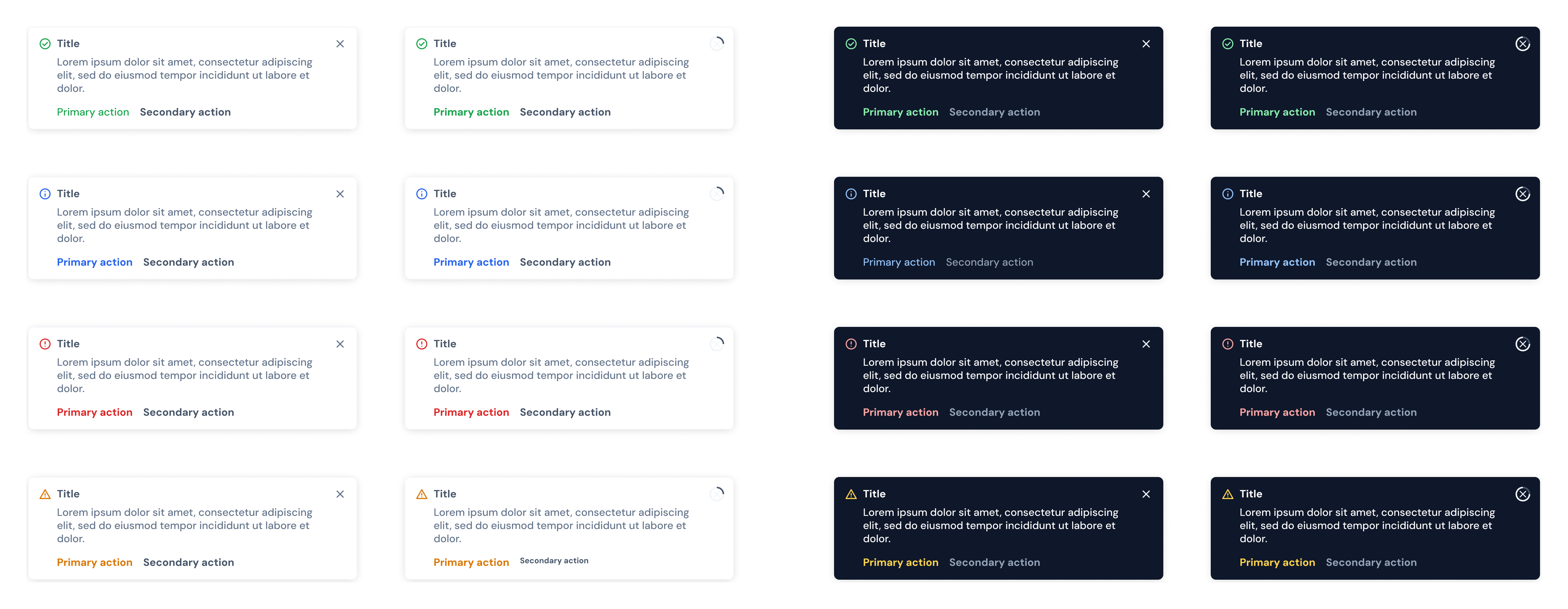
I designed light and dark notification variants while keeping each state's content and actions consistent.
Content
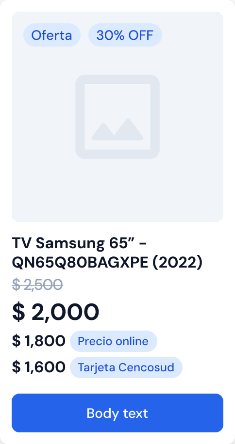
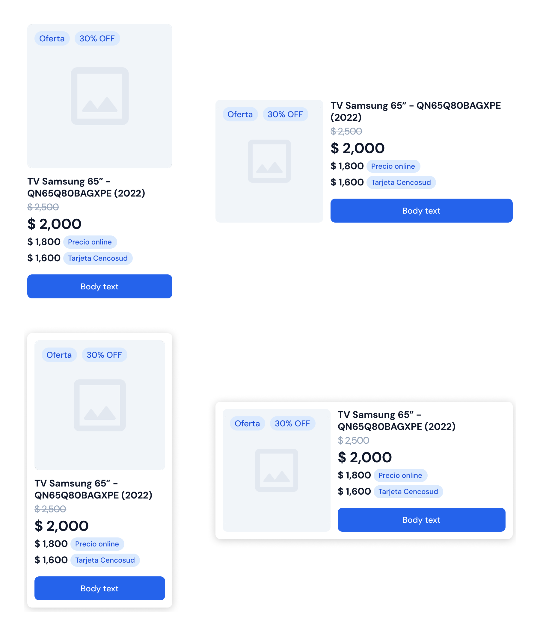
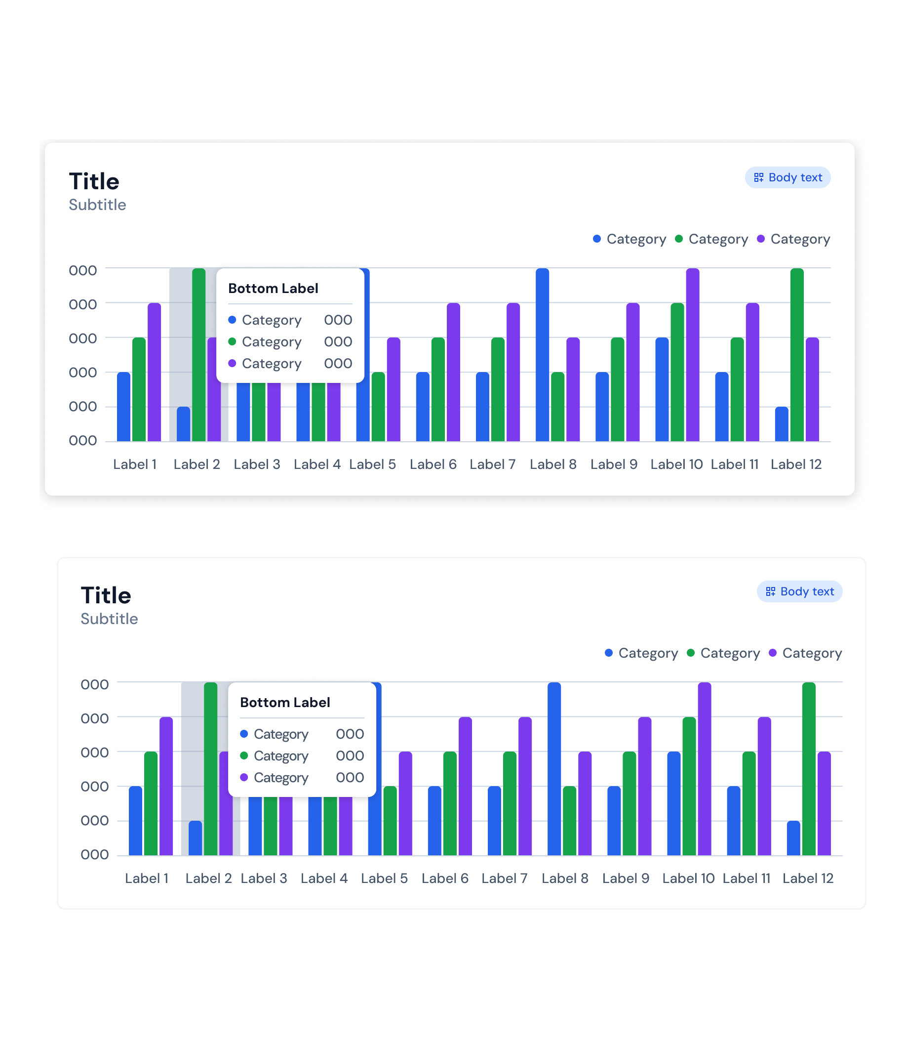
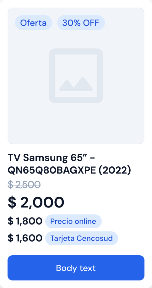
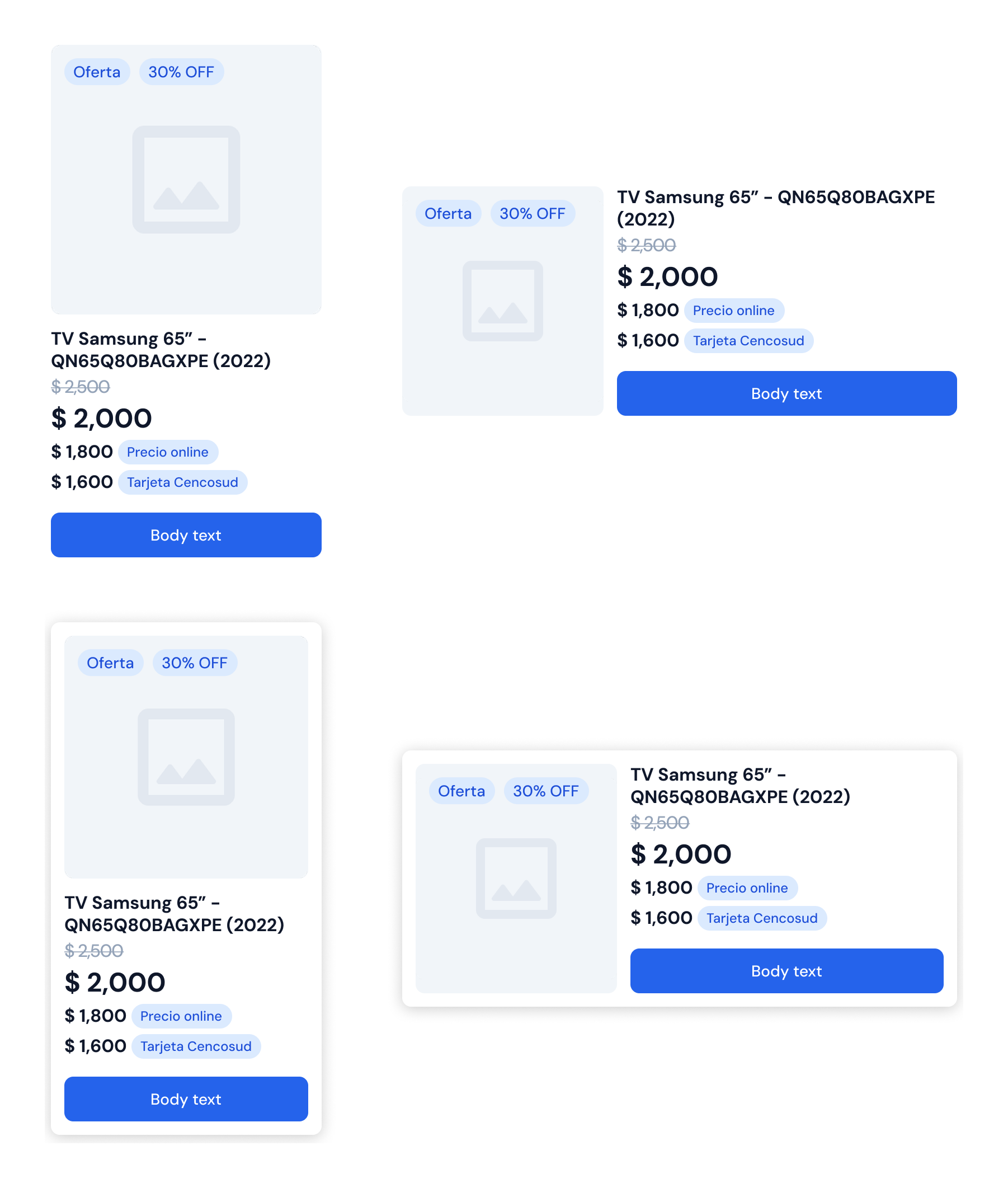
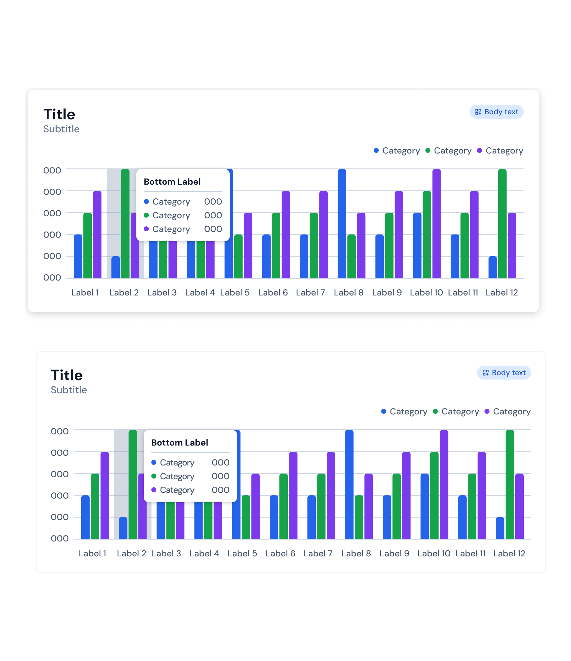
I built product cards with pricing and offers, and bar charts with legends and tooltips.
In context
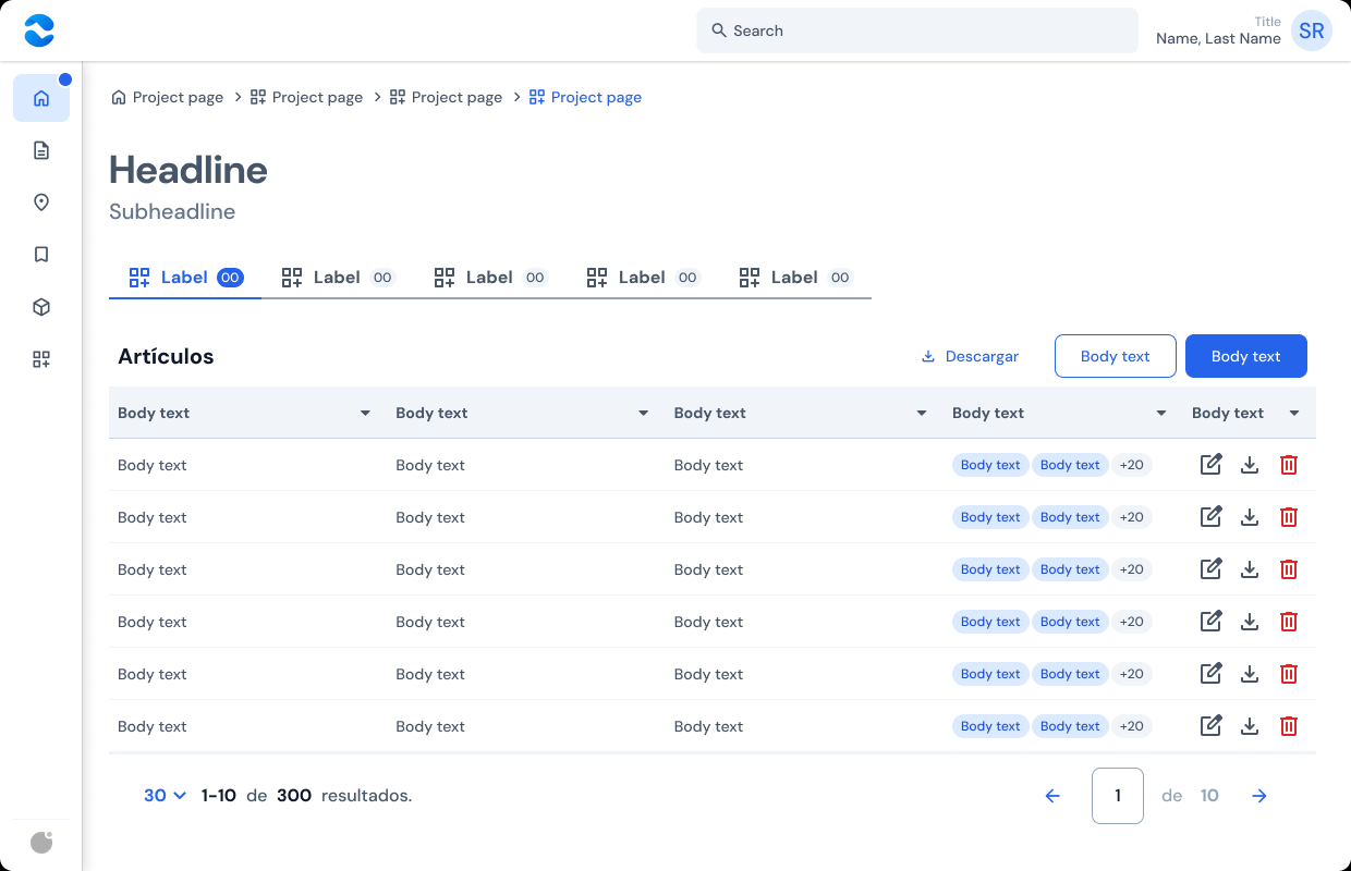
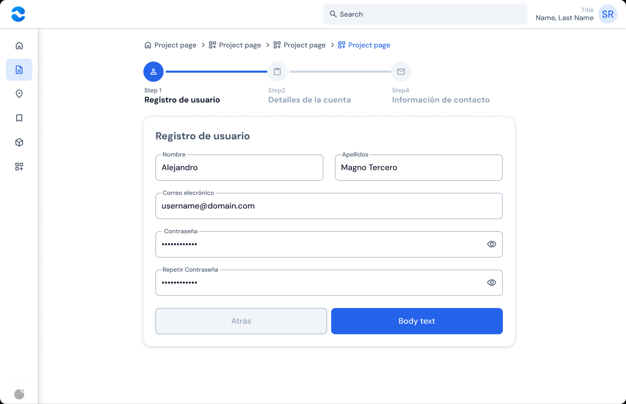
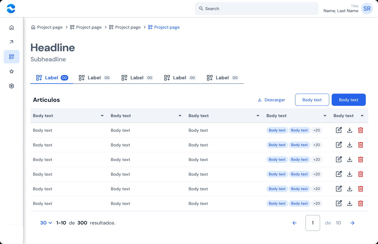
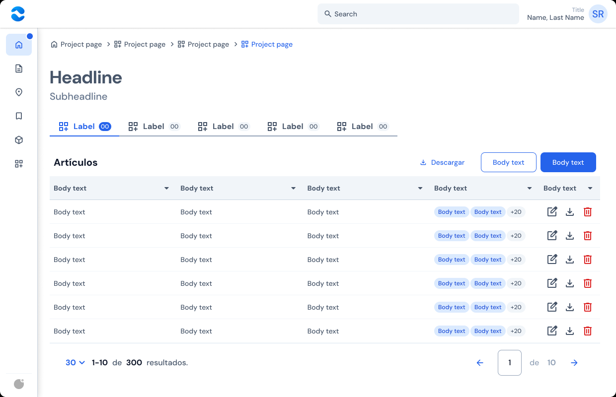
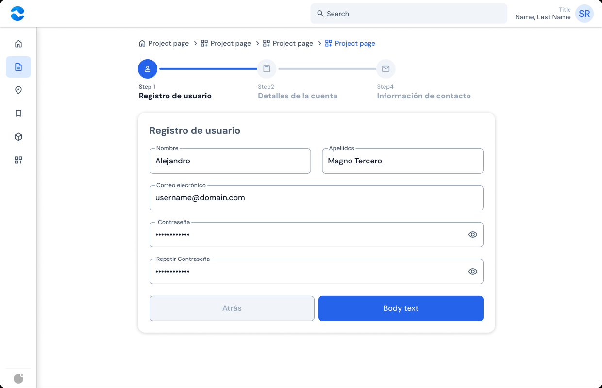
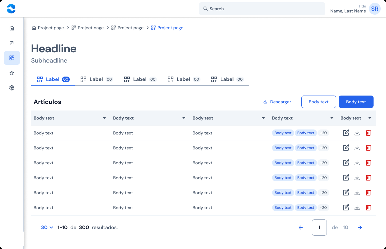
I built desktop templates from existing components to assess their use in dashboards and sign-up forms.
Sidebar
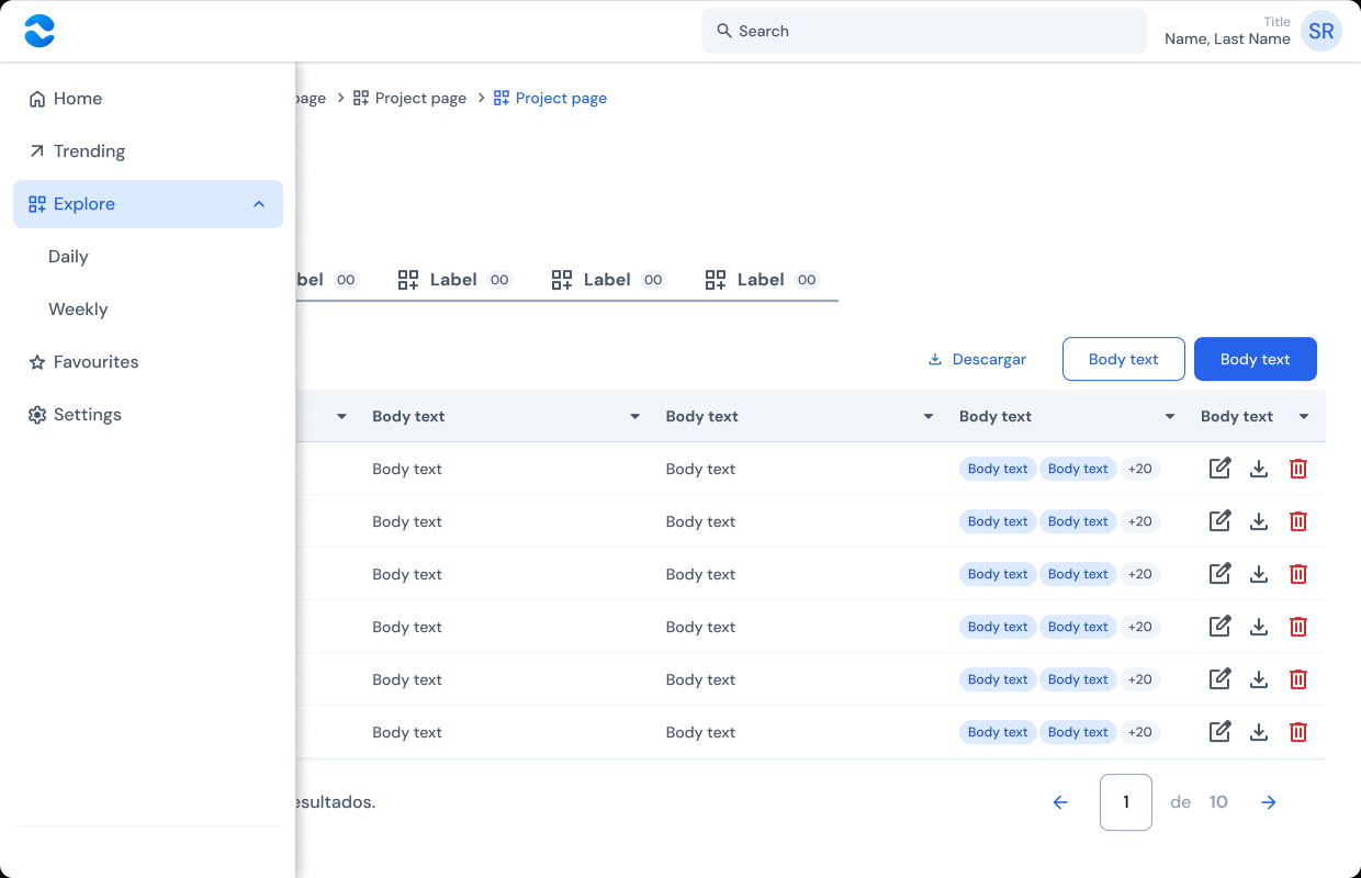
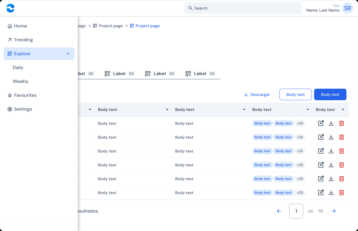
I designed a hover-expanding icon rail that overlays content while keeping navigation in place.
Implementation
I defined the Figma variables used by components: Theme/Primary for branding, Spacing/2, /4, and /8 for a 4 px-based spacing scale, and DM Sans for Headline, Title, Text, and Caption roles.
I documented each component on its own page, including a variant matrix and usage guidance. I also built desktop templates from the same library.
The design system I worked on for Cencosud.
Corporate work: I share only the essentials, retaining the sample content from the original Figma file.