



Tokens sourced from Figma
I used a DTCG snapshot of Figma variables to generate CSS and Tailwind utilities. Components consume semantic tokens, and an automated check catches differences between the snapshot and the code.
An independent design system, from Figma variables to React components.
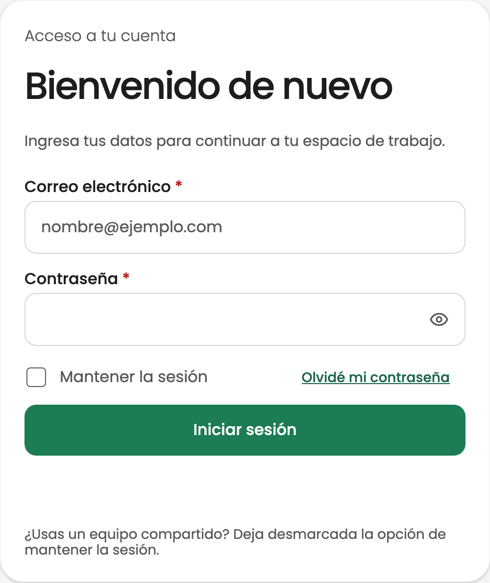
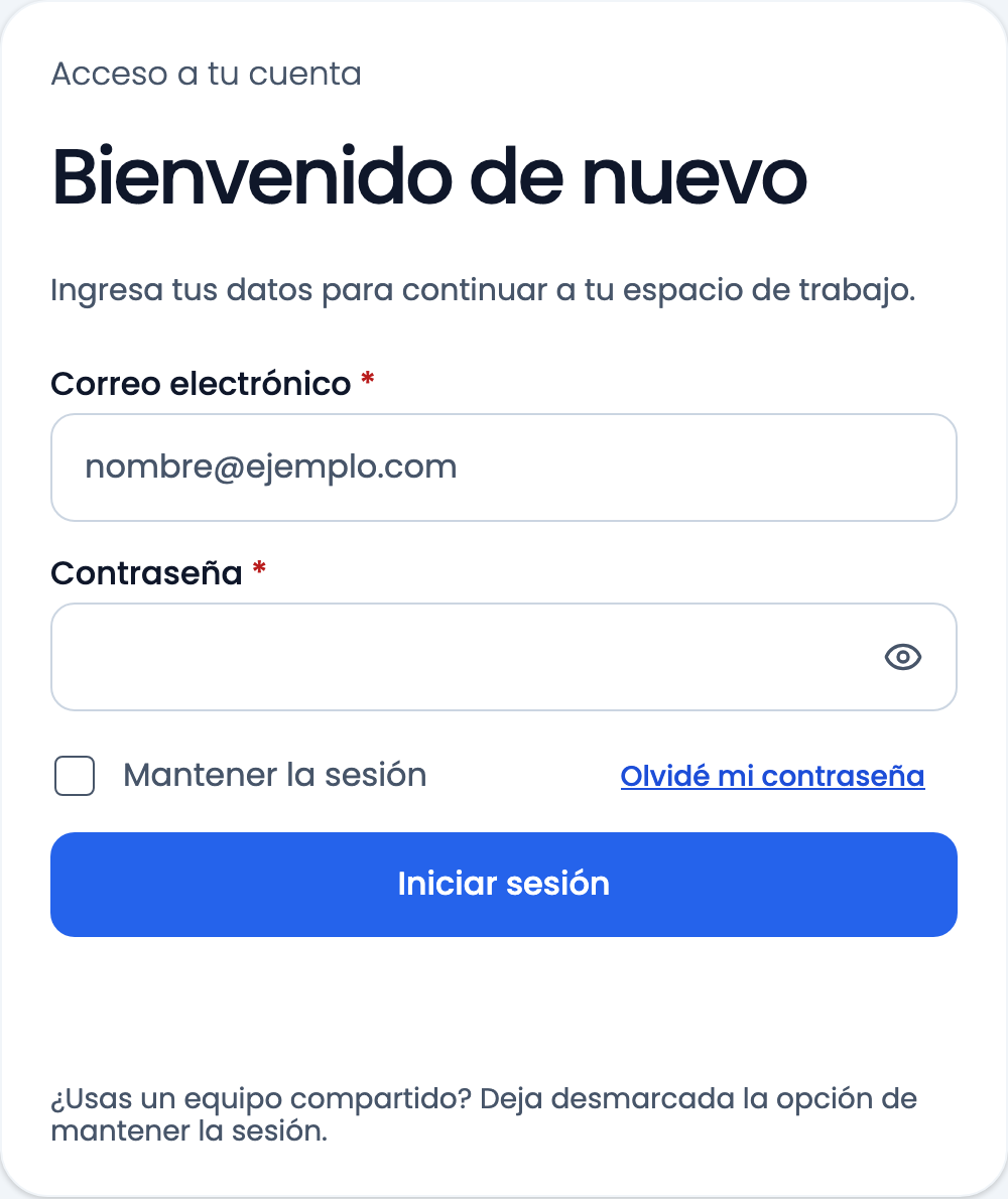
Teams designing and building web products
Design System · Ávila and Base · Light and dark
Design tokens / React components / Storybook
The idea
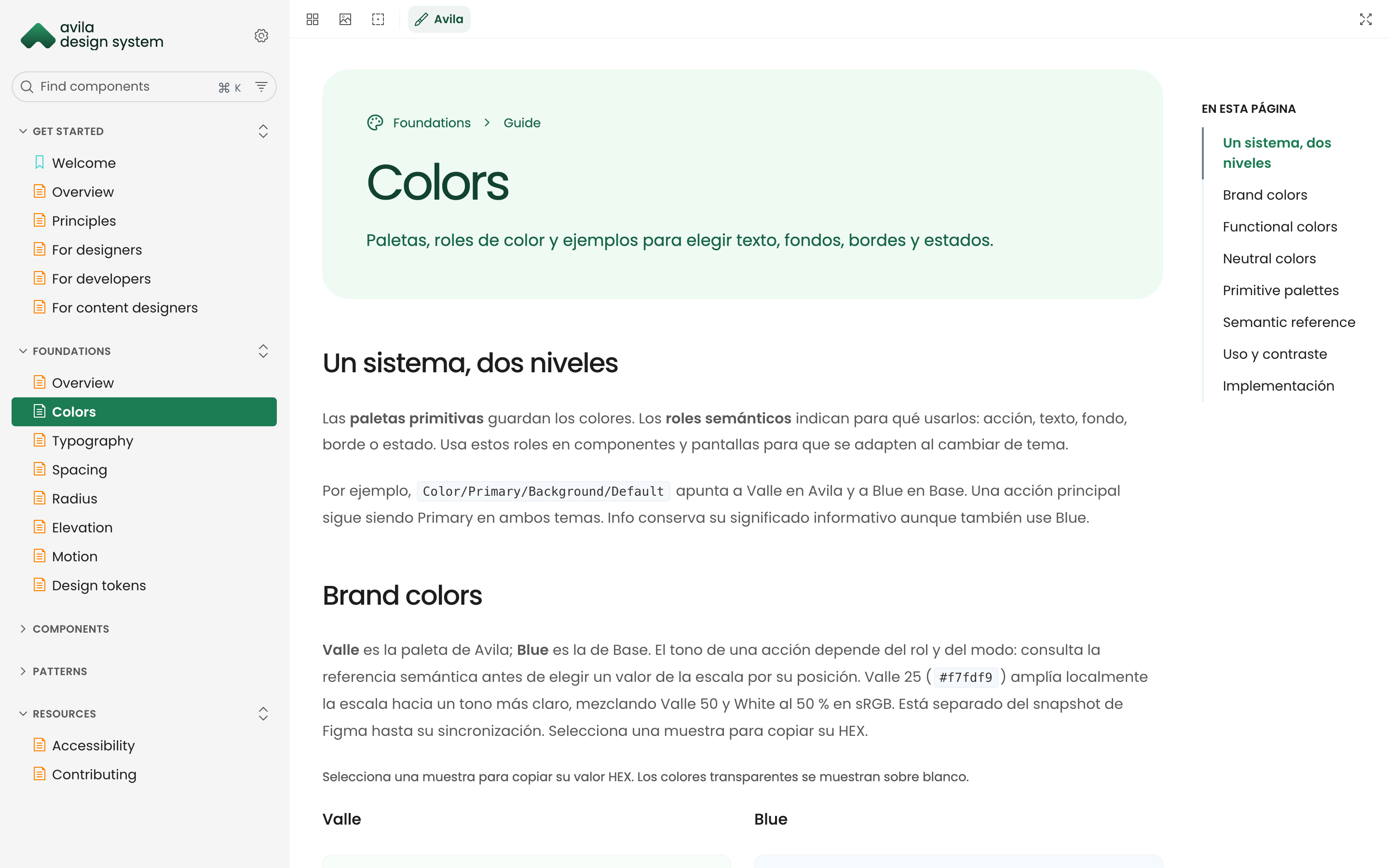
Ávila is my own design system. I built it to align Figma variables and component properties with their React implementations. The library supports four themes and is documented in Storybook, where I can review the components in action.
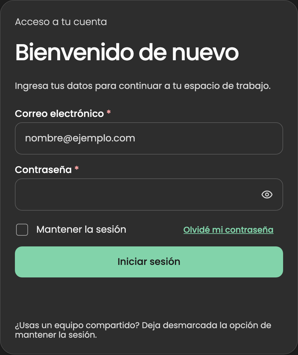
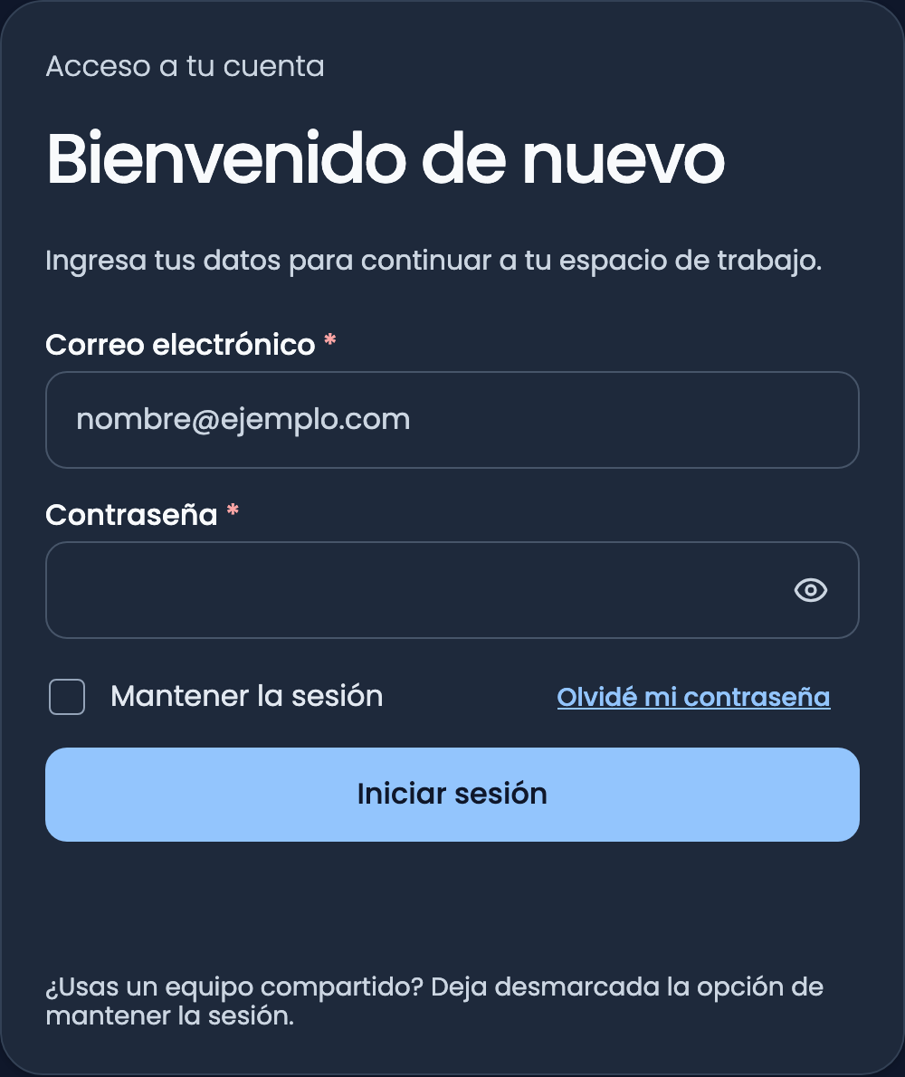
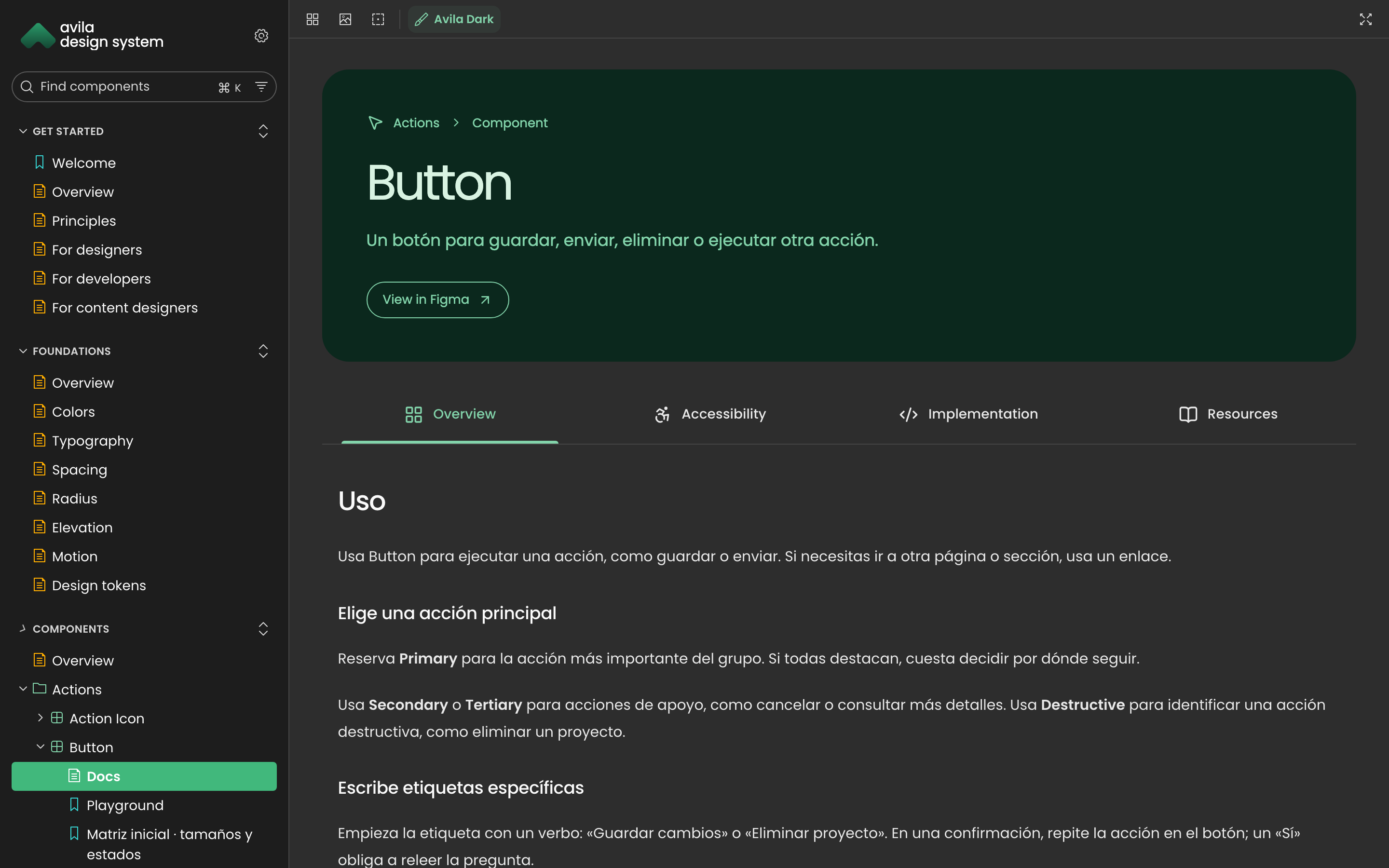
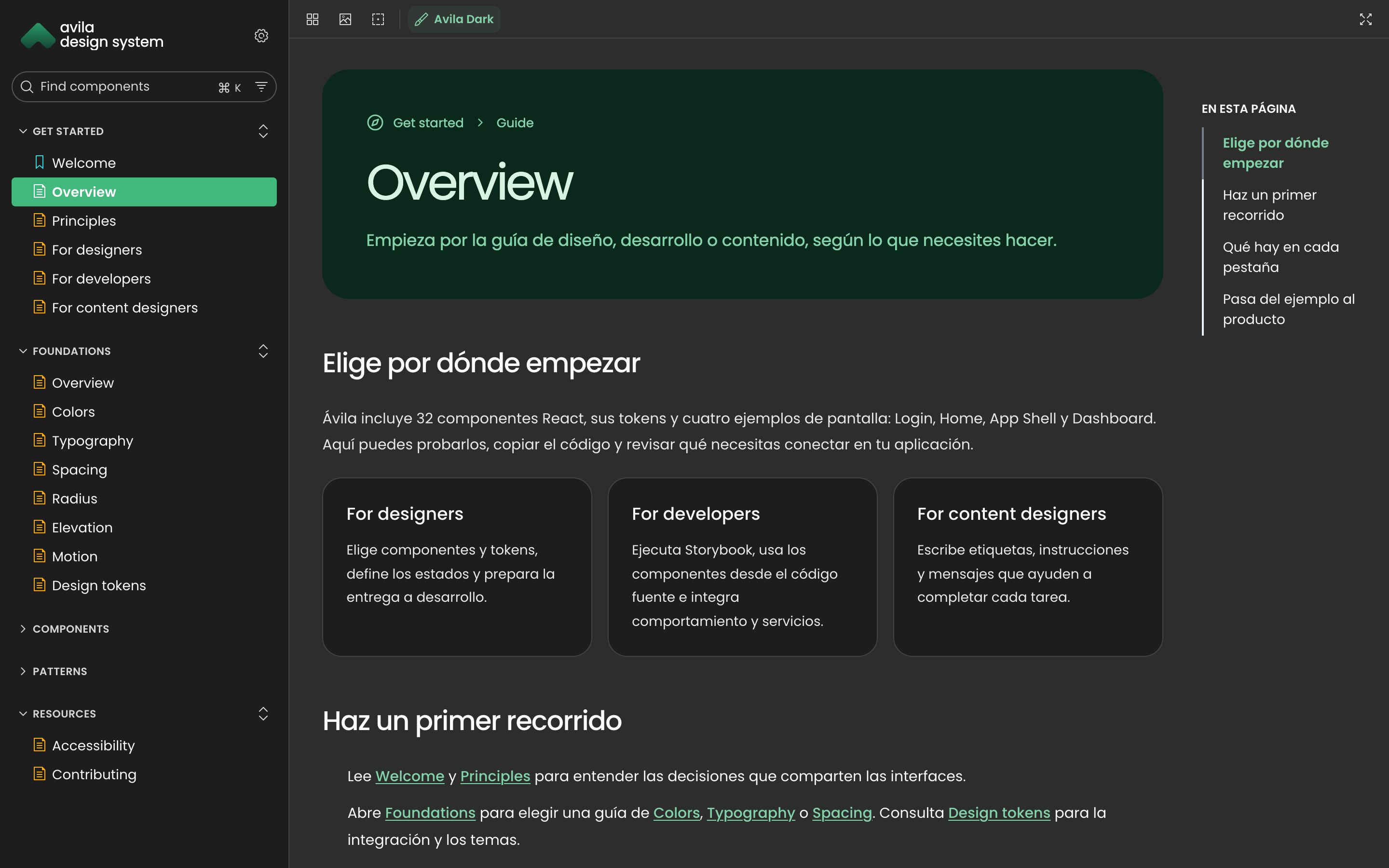
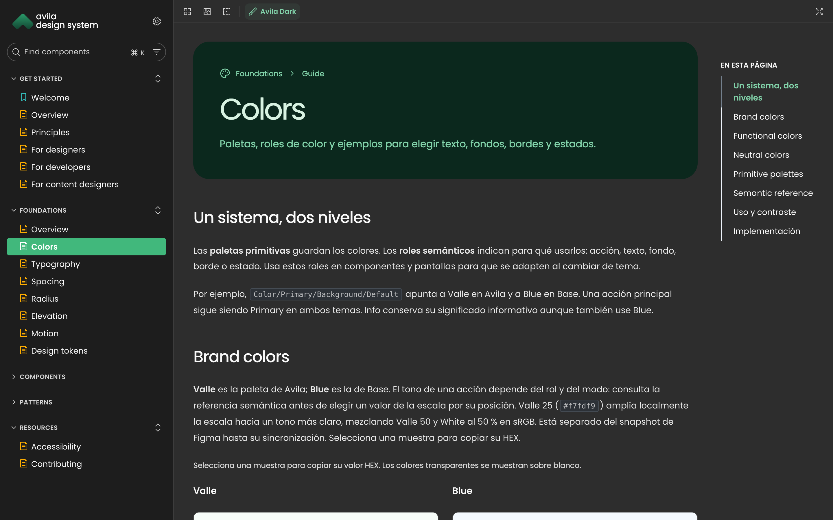
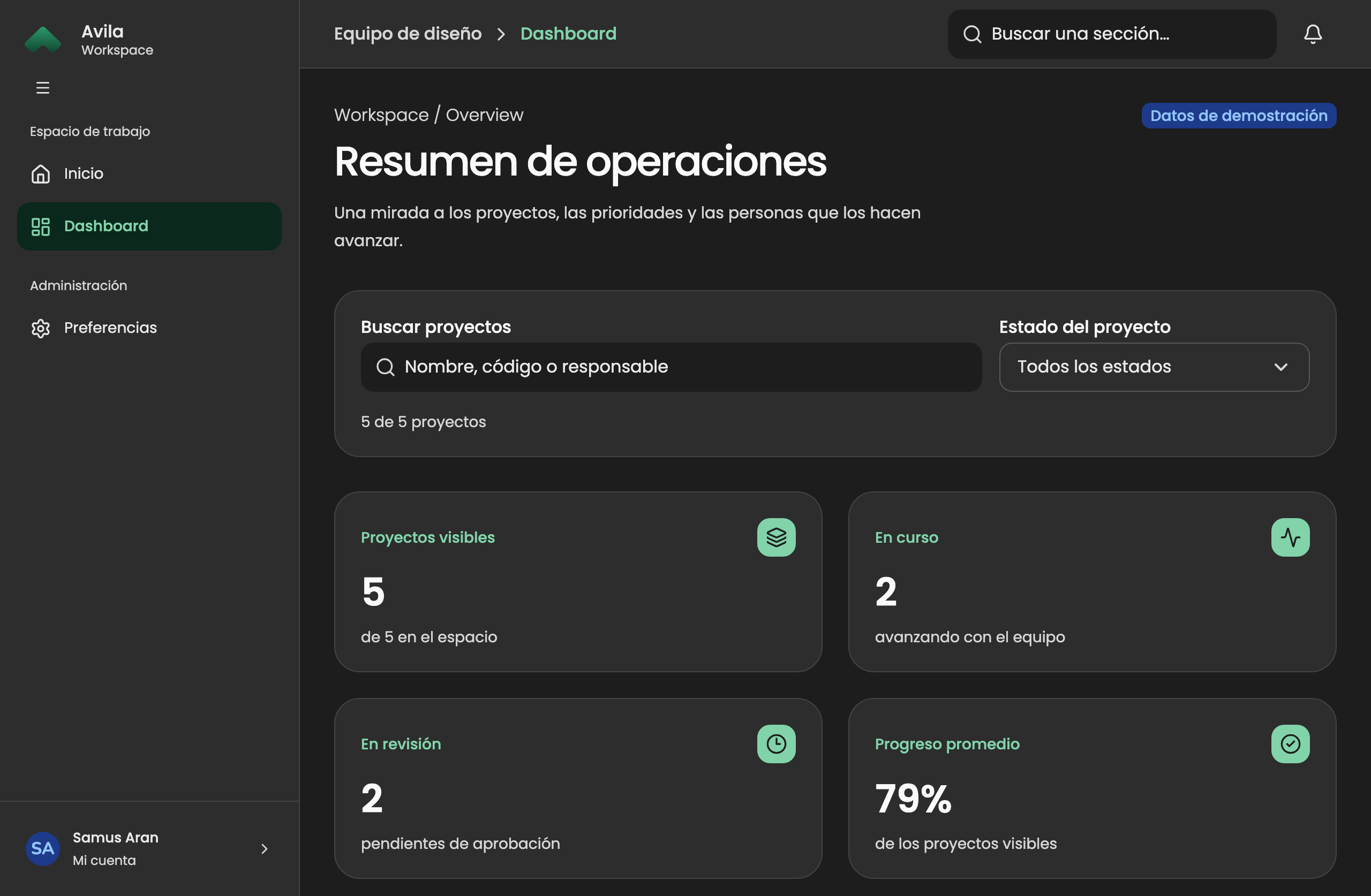
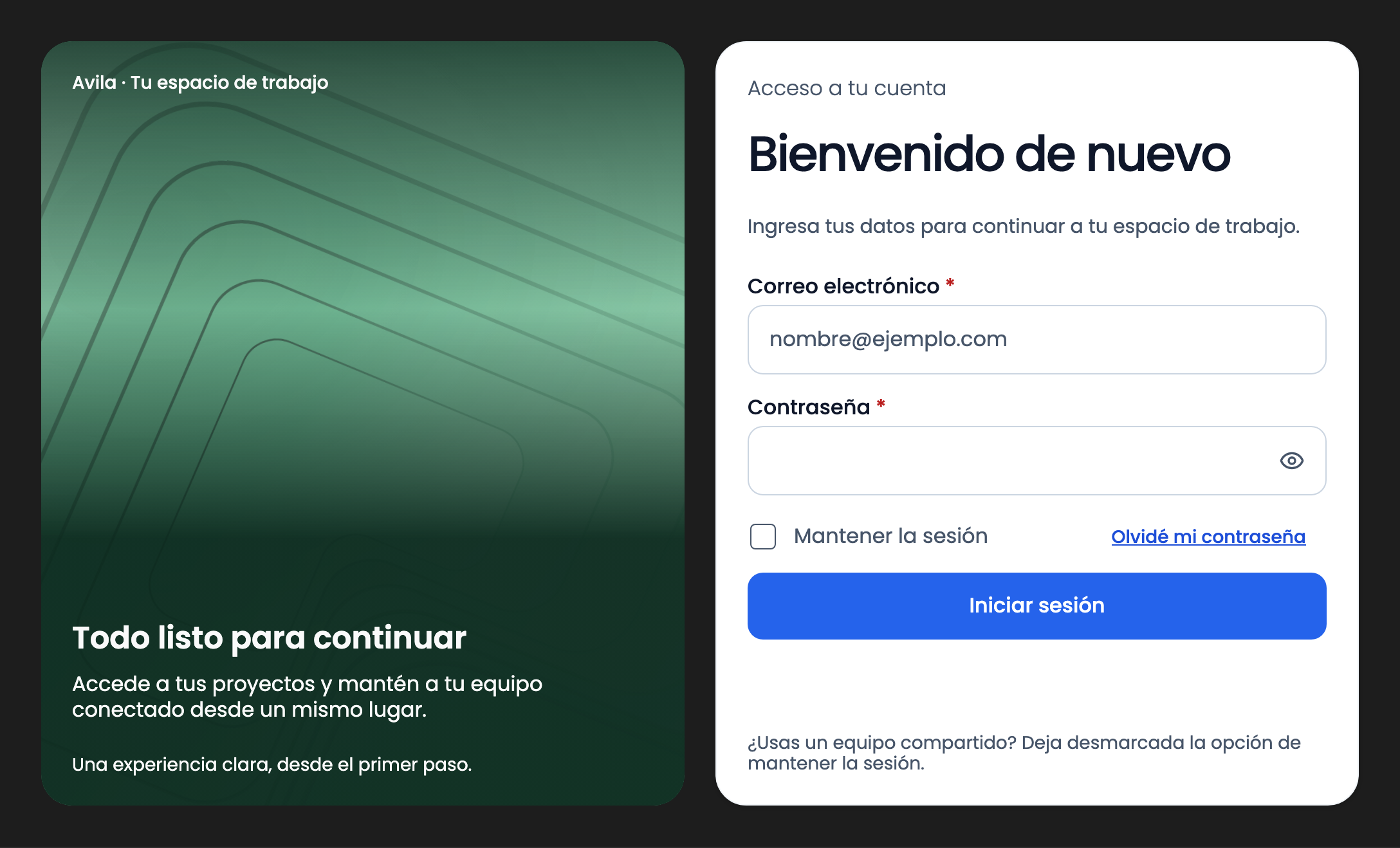
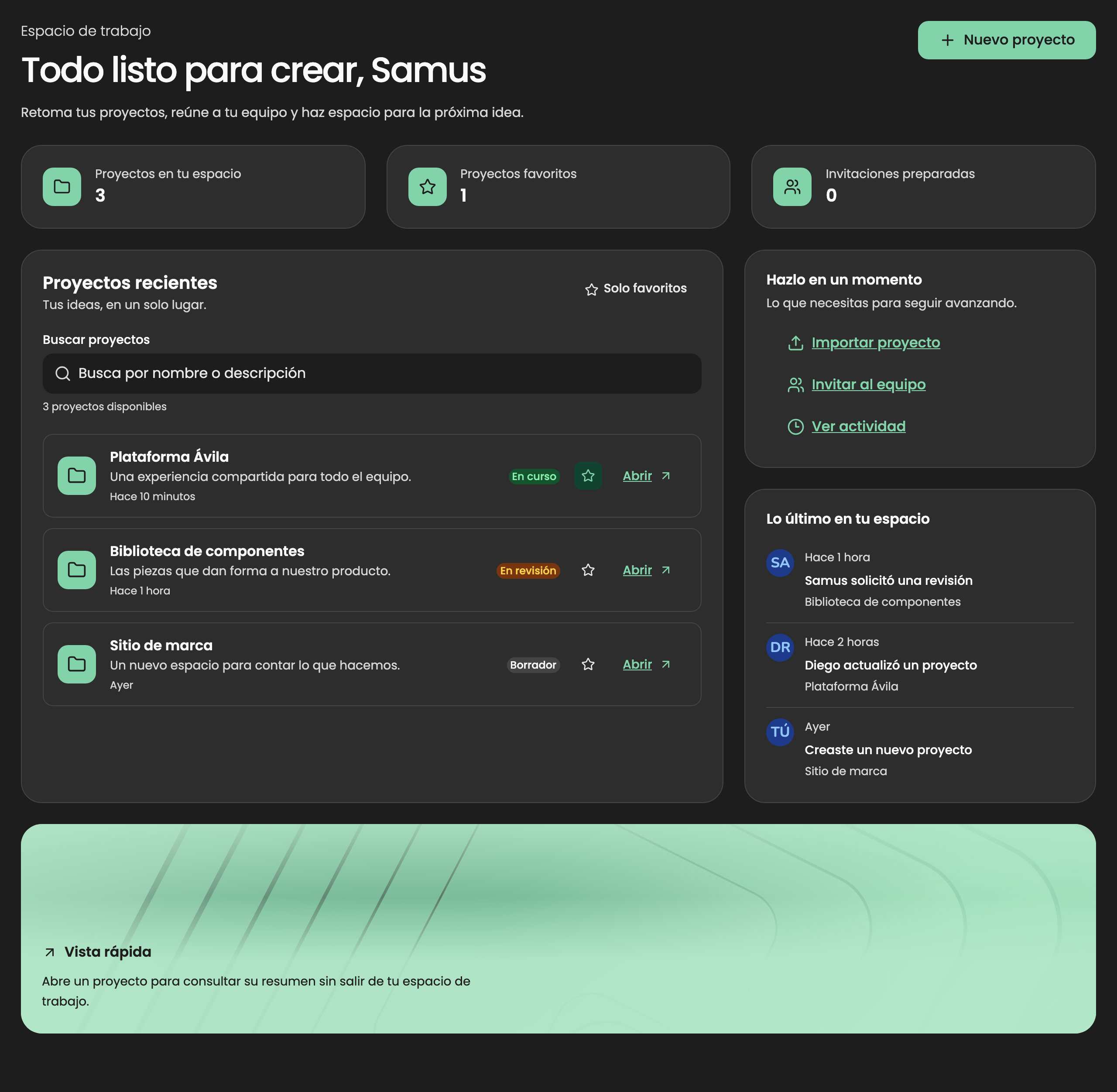
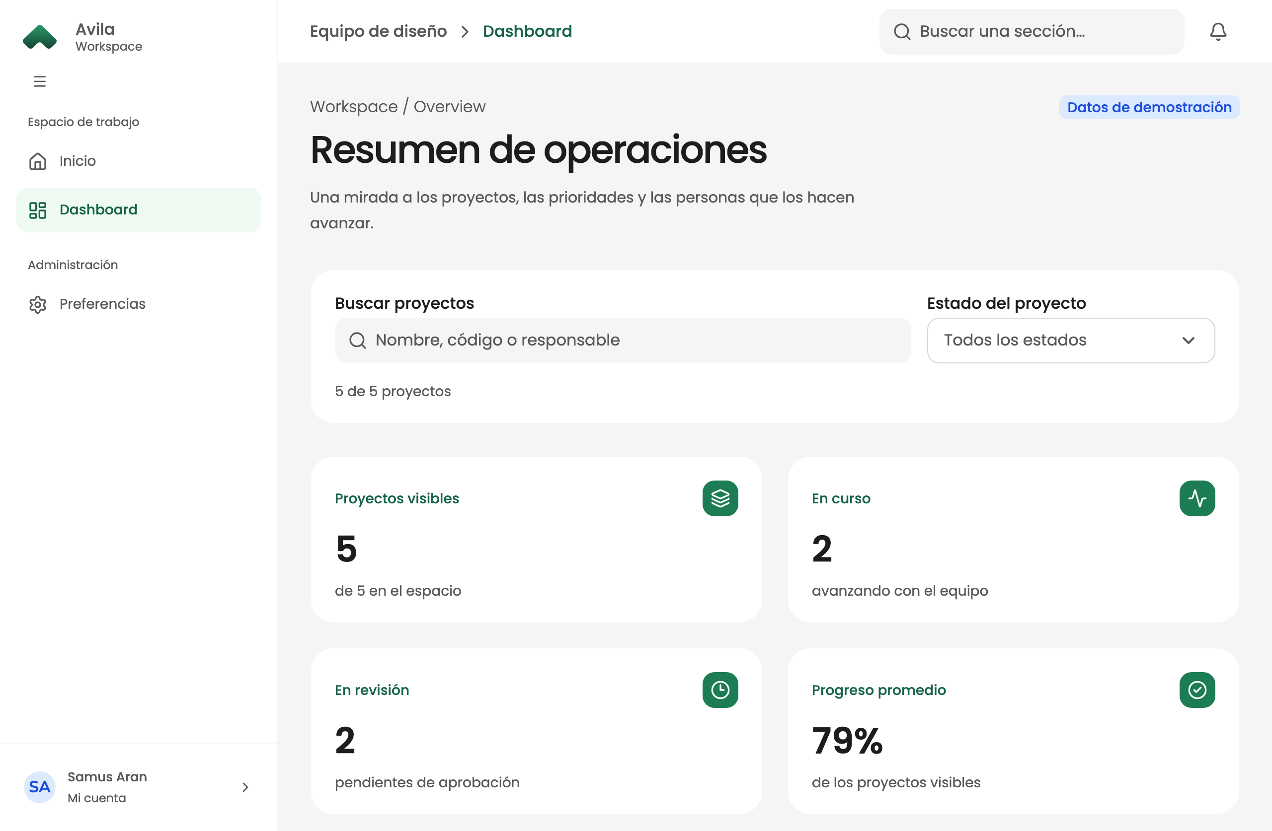
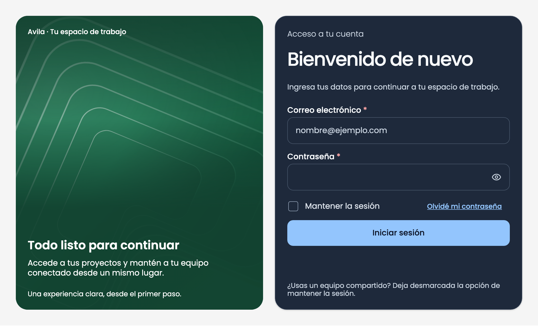
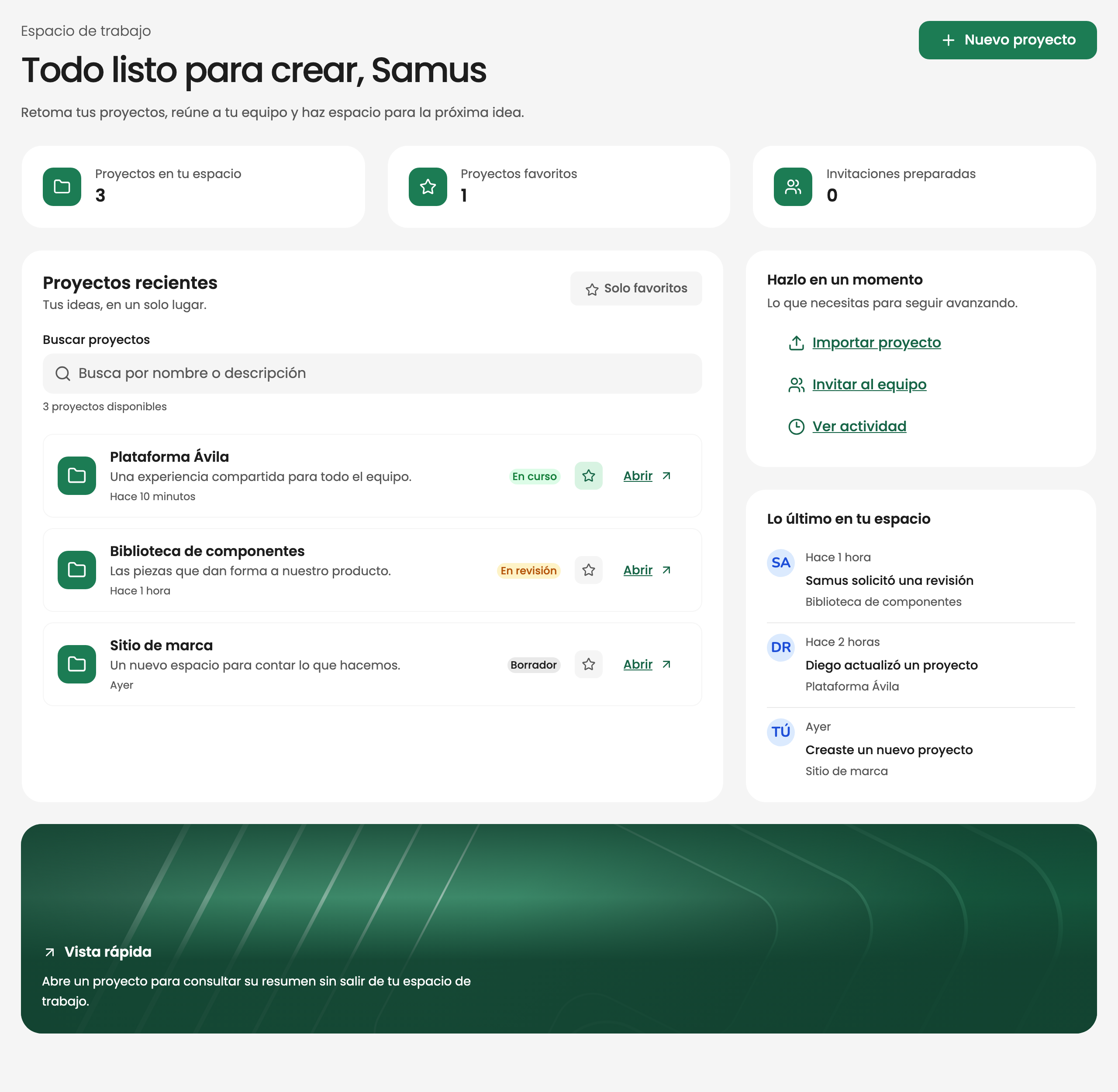
Screenshots are taken from the system's Storybook, using sample data.
Primitives
I organized eight color ramps alongside spacing, radius, blur, stroke, and typography scales in a primitive layer. Components use the semantic layer.
Semantic roles
I defined roles whose names stay consistent across four themes. Primary maps to Valle in Ávila and Blue in Base; dark mode also adjusts the surface hierarchy.
Spacing
I organized fourteen steps with usage-oriented names, such as Medium for 12 px. Samples appear at actual size against a 128 px guide.
Radius and elevation
I created seven radius levels from None to Full, plus six shadows with specific offsets, blurs, and spreads to distinguish surfaces.
Typography
I used Poppins for Display, Headline, Body, and UI roles, with defined sizes, line heights, and weights for each style.
Documentation
I documented usage, accessibility, implementation, and resources in Storybook, including links to Figma nodes. Documentation responds to the active theme.
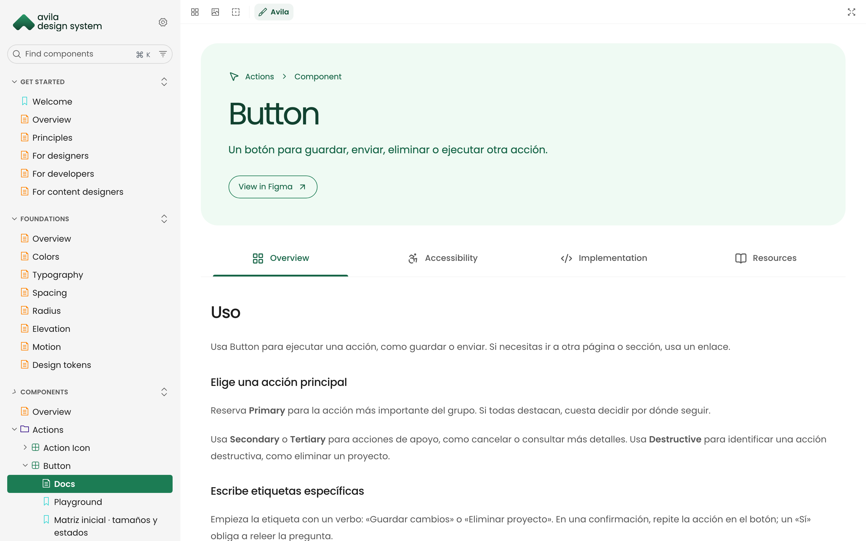
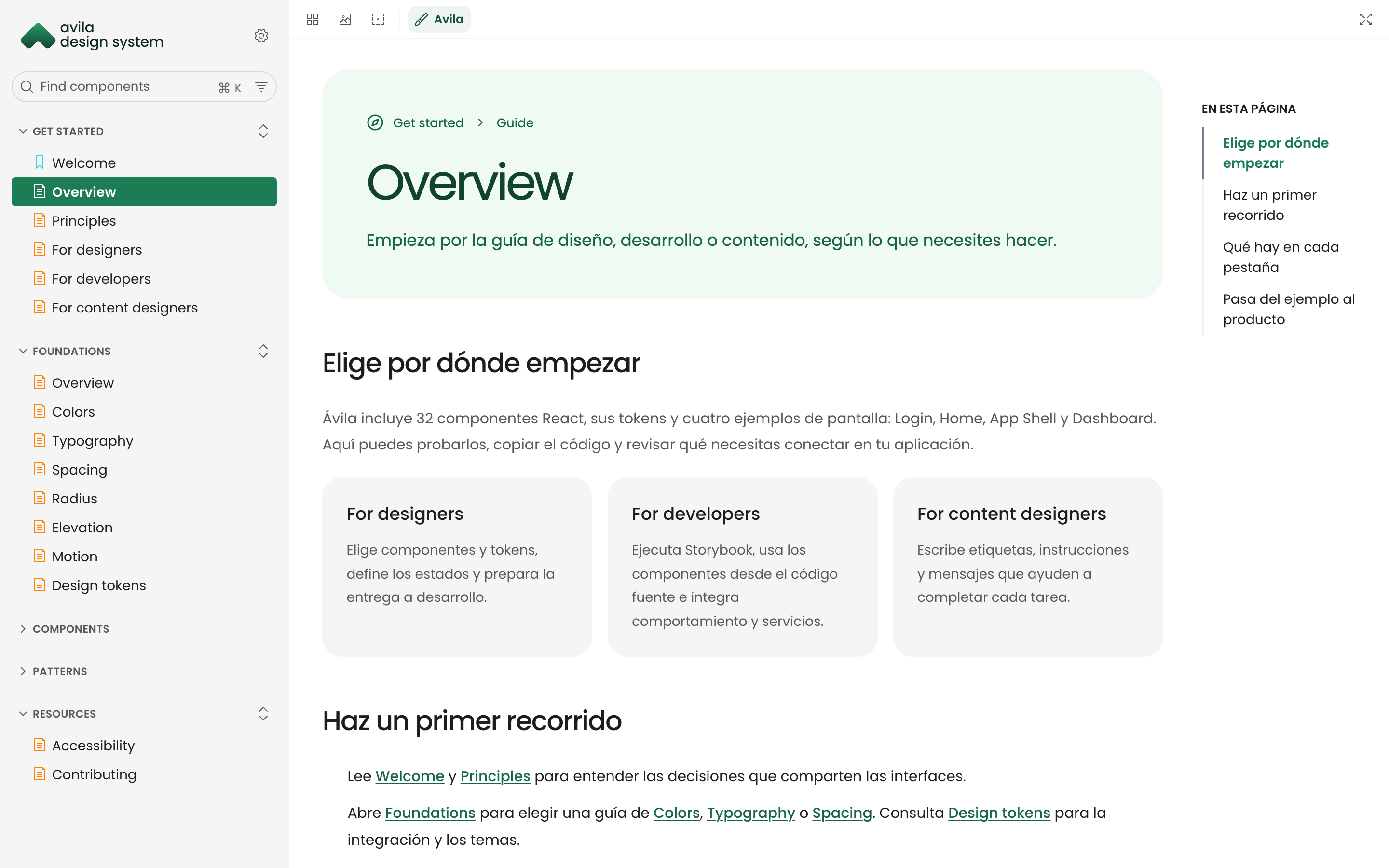
Guides
I wrote getting-started guides for design, engineering, and content, alongside foundational concepts and token references.
Patterns
I built screen patterns with navigation, search, filters, and metrics to review how components work together. Appearance changes are driven by tokens.
Themes
I implemented theme boundaries with data-brand and data-appearance. A card can use Base inside an Ávila page and have a different appearance mode.
Home
I created a workspace home with metrics, search, projects, favorites, and activity to test the system in a product context.
Implementation
I used a DTCG snapshot of Figma variables to generate CSS and Tailwind utilities. Components consume semantic tokens, and an automated check catches differences between the snapshot and the code.
I implemented theme boundaries with data-brand and data-appearance. Elements inherit both attributes, and boundaries can be nested to combine brands on a single screen.
I documented each component in Storybook with usage, accessibility, implementation guidance, and resources, plus a link to the corresponding Figma node.
An independent design system, from Figma variables to React components.